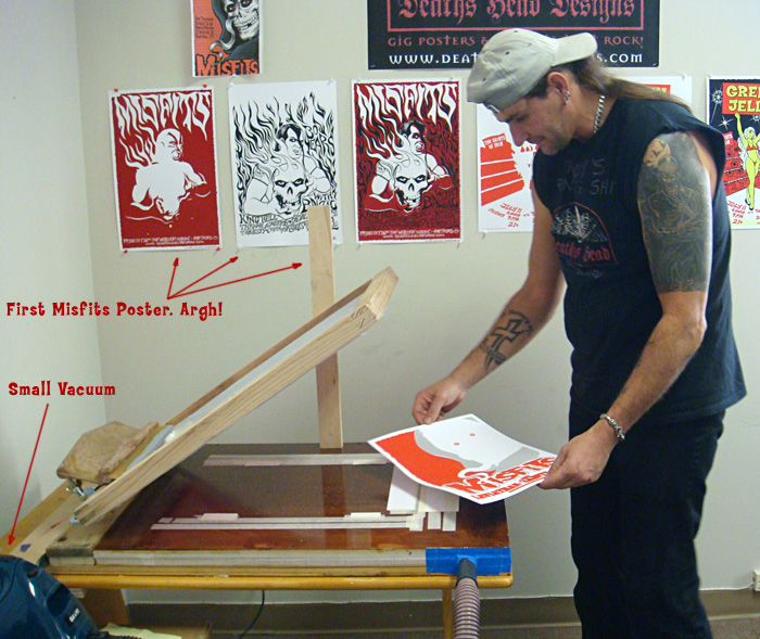
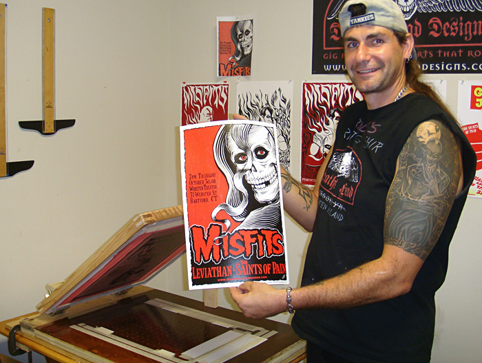
Though our first poster for The Misfits

I draw the art for all of our projects by hand and scan it at a high resolution, usually 400 or 600. That’s often higher than I need but it can come in handy for a variety of reasons. I bring the art into Photoshop, touch up the line work (because I’m picky) and do the color separations on separate layers. I print out each layer on a large format inkjet printer (Epson Workforce 1100
All of these steps could have their own explanation, and I will possibly go into detail about some of that in the future, but things like art, scanning, burning screens, etc. are pretty basic and covered in many other places. I’ve been concentrating on the things we do that are less unusual.
So at the point this tale of edification begins, I have the poster press we built, 3 prepared screens and the paper we will print on. One thing – if you are doing more than one color on your poster, you will need to start the project the night before you will screen print and hang or lay out the approximate amount of paper you will need. Paper can change shape with humidity and temperature so you want it to equalize over night or at least for a few hours so that it doesn’t change shape during your print run and affect the registration of your colors. I generally have about 1/16” overlap of the colors on the separations. That’s usually enough. I will do a more detailed write up on color separations next time.
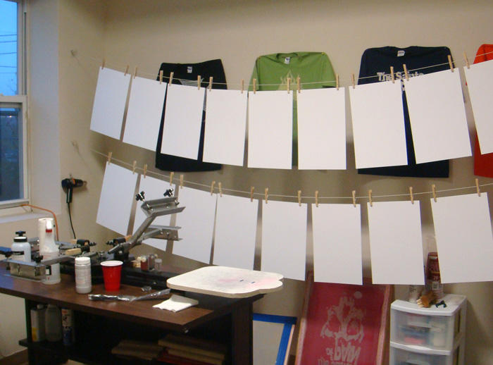
The paper was hung up overnight:
This Misfits poster was printed in 3 colors of acrylic screen printing ink for paper – red, grey and black. In most cases you would want to print the colors in order with the lightest first to the darkest, last. In the case of this poster we didn’t exactly do that, but close. We printed the red first and then the grey even though the grey is a tiny bit lighter. The colors are semi-opaque and my theory was that the grey would over print the red in some spots and we would have areas of light grey where it overprinted the white paper and darker grey where it overprinted the red. But the ink we used was actually more opaque than I figured so the effect is very subtle. We had gone all over New York City to art supply stores to find just the right red acrylic ink we wanted and then I had to mix the grey from white and black.
To start with I laid a sheet of the poster paper (Cougar opaque white 100# cover, that we had cut to the finished poster size for us at Limited Papers) in the middle of the vacuum table of the press and turned on the vacuum to hold it in place. I had cut some rectangular pieces of paper out of one of the sheets of poster paper to make guides and I taped these around the sheet of poster paper to mark where I would place the paper each time. I placed the guides right up to the edge of the paper sheet so that every time you placed a sheet of paper on the press it would fit right into the guides and be in the exact same spot. The sheet of paper fits into the guides kind of like putting a piece of a jigsaw puzzle in place. I used guides on three sides of the paper. Not everyone does. Some people use only three guides on two sides. Which is called three point registration. But since our paper gets a bit wavy when we print on it I wanted the extra points of registration.
The guides:
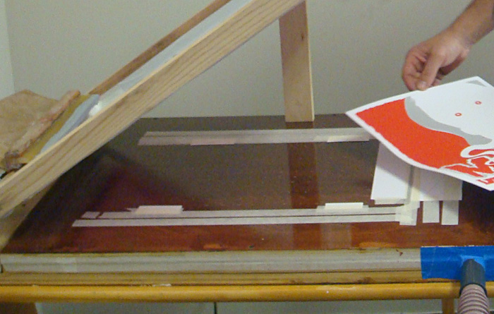
I use the same paper as the posters will be printed on for the guides so that there is no unevenness under the squeegee as it is pulled across the screen. I tape the guides down with a low tack masking tape that doesn’t leave a residue. I use the tape and some more paper to cover all of the holes that won’t be used to hold down the paper sheets we will print on. That way the vacuum won't suck your screen down onto the table, ruining your off contact and is concentrated on the paper sheets we want to hold in place.
Next I centered the design we will be printing on the paper using the transparency film I burned the screen with. I used the black film in this case since it has all of the line art and I can register all of the other colors to it. If a design is hard to register I will use registration marks, but in this case the colors were easy to register to each other (and I did the art myself and was familiar with it, which helps), so I didn’t bother. I taped down the transparency in position on top of a sheet of blank paper and used that to position the screen. I carefully lined up the screen over the design, pressing down to make sure it was exactly in place over the line art and then tightened the clamps, making sure the screen didn’t pull out of register as we screwed the clamps tight.
Here is the tranparency film taped on the sheet of paper laid into the guides:
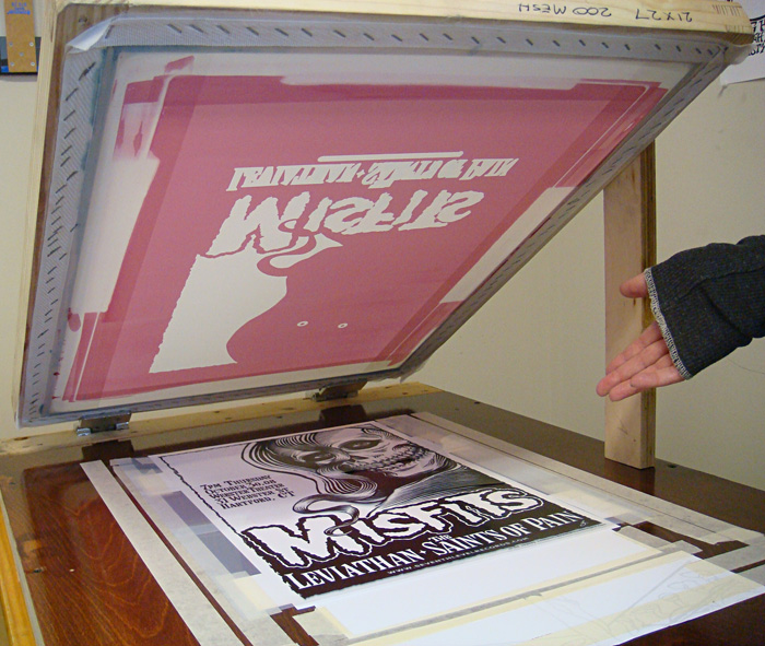
Lining up the screen for the first color, red:
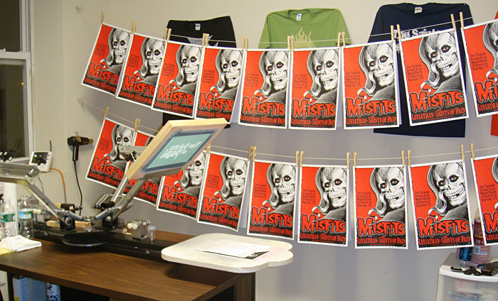
Then we screened the first color, red. We used the ink right out of the jar. We didn’t need to dilute the ink and I didn’t mix it with a retarder to slow the drying time. We haven’t found that necessary with the acrylic poster inks. We hung the posters on string with clothespins, putting 2 back to back to save space. You can also use a rack to dry the posters flat or just lay them around. Whatever works.
Screening the first color:

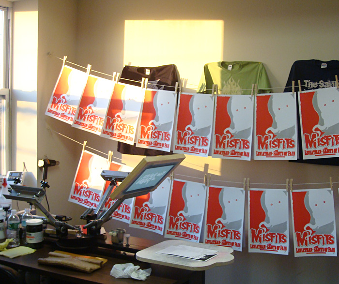
The first run of posters hung up to dry:
We let the posters dry about an hour or so to be safe. Drying times will vary so you just have to feel the ink and see if it’s dry. I mixed up the grey ink for the second printing, lined up the screen for the grey print on the same transparency taped to the same sheet of paper and we printed the second color. And let that dry the same way.
Ready to print the second color:

Printing the second color:

You can see we keep the vacuum in easy reach to switch it off and on:
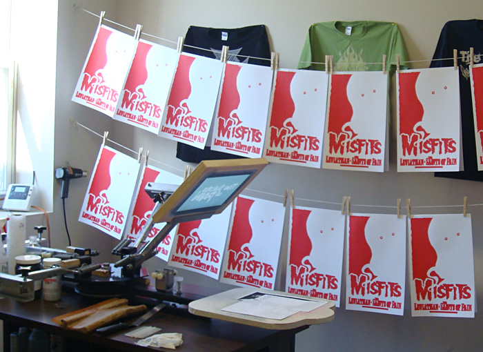
The second run hung up to dry:
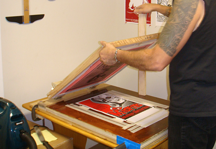
Same process for the last color, black. This time the screen was even easier to line up the screen since I was matching it to to the same art. The paper had gotten somewhat wavy by this time, but not so much that it caused a problem. The vacuum still held it down well enough to keep it from shifting and the print went on fine. Once the prints were dry we stacked them and put them in a case, and they all flattened out.
Printing the final color, black:
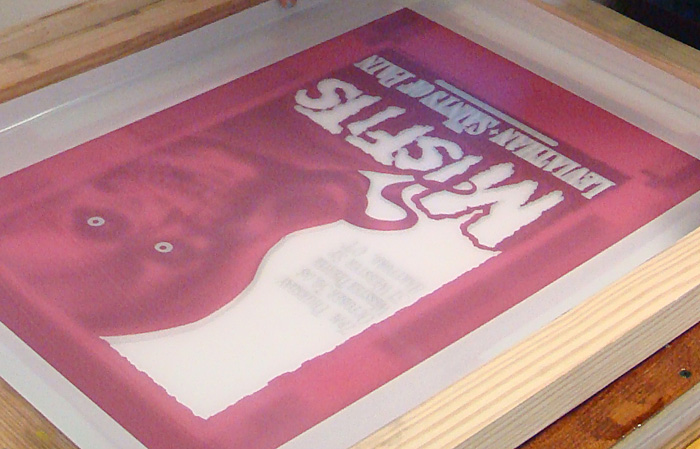
The finished poster:
Hung up to dry:
Next: How to Do Color Separations for Screen Printing in Photoshop.
this is really cool...what type of film do you print transparencies with? can your printer get very dark copies?
ReplyDeleteWe print our tranparencies on Victory Factory 2 Inkjet Film. (http://www.victoryfactory.com/film.html) That was recommended to us ages ago and it's pretty much all we've ever used. I had an old, smaller printer to start with and I had to darken the blacks with a sharpie marker (the industrial ones) or double up the print but since we got the large format Epson Workforce 1100 injet printer the prints have all come out dark enough to burn just fine. Very pleased with this printer and with the price of it, too. I bought it through Amazon.com.
ReplyDeleteThanks JayJay! Your blog is the best I have seen for giving us DIY types great info and awesome visuals to back it up. Best of luck, looking forward to reading more!
ReplyDeleteThanks! I'm so glad you like the blog! We had a hard time at first and we've learned a lot, so I am hoping some of this helps people out.
ReplyDeleteMan, you rock. This is so informative. I am an artist and needed to do my own prints to keep the integrity of my series. I had never screen printed and now i feel confident that i can pull this off. Thank you.
ReplyDeleteFeel free to email me with any questions! I'm happy to help.
ReplyDeleteGreat article, really cool artwork. What ink did you use for the prints? I recently did a print and tried black Speedball ink from a local art store and the ink came out really flat looking. Also can you recommend a good metallic ink?
ReplyDeleteHey! Thank you for tis blog!
ReplyDeleteInstead of using papel for registration I use old x-ray images cut into stripes. they are slim and durable.
Great article!!
ReplyDeleteYou explained the process really well and the photos were perfect!!! I am teaching a beginning screen printing class this summer and I sent this article to my students.
Cheers,
Kevin