A bit of my creative process.
Got the job one day to do a new poster for Leviathan, the number one band I did posters for. They were opening for Six Feet Under, death metal band extraordinaire. I had been doing some sexy pin up girls on the posters for that band, so I thought I would do another one. The name of the band, Six Feet Under, does suggest a death-oriented theme so a sexy, deadly pin up girl was one idea I had. I love horror movies and every once in a while the girl ISN’T the victim. lol. So I settled on the idea for a girl with a bloody axe who may have just gotten some guy ready to be put six feet under. It turned out to be one of my most successful posters.
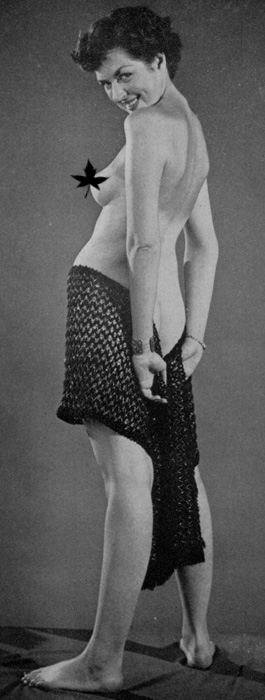
I had pitched the idea to the band and gotten a go ahead on it. I played around with some loose sketches and looked at my girl photo reference files to see if I could find a good pose. I like to collect old photos from the 40’s and 50’s. Mostly I like the coy, flirtatious body language and the weight of the women more than the modern look. I find that the women in most modern photos are too thin to look sexy to me, I'm repulsed by breast augmentation surgery and the body language is totally different. A sort of forced, self conscious sexuality that lacks that sense of fun many of the older pin ups have. I also like the quality of the light in the older photos. So I found a photo that had a nice pose and attitude to base my drawing on. I generally don’t stick too close to the photo reference, but use it as a guide to help me make the pose and proportion believable.
I got my boyfriend to take photos of my own hands holding a hammer behind my back to help get the hands right. Hands are difficult for me so I really have to work at them. But I can’t show that photo because I’m not uploading a photo of MY bare butt. lol. The drawing worked out pretty well and I inked it. I actually did the blood on the ground separately on another sheet of paper because I didn’t plan ahead and ran out of space on the first sheet. Since getting used to working with the computer, I sometimes work kind of rushed and sloppy and just fix things later. I figure the end product is what matters. I don’t like to sell my original artwork so I don’t go into a job with the idea of producing the art for a secondary sales market. Many people do, and that’s just fine. I guess I just can't wait to see the final result so I'm always in a rush to get to that point. Besides, technique isn't what matters on posters like this as much as it would on a painting. So, I scanned everything and put it all together in Photoshop and cleaned up the line work.
I knew I wanted two of the colors to be black and red, but it took a little experimentation to decide on the aqua blue. Once I tried that I liked it immediately. The icy coolness seemed good for a beautiful axe murderer. And the aqua has a nice vibration against the red, since it's close to the compliment on the color wheel.
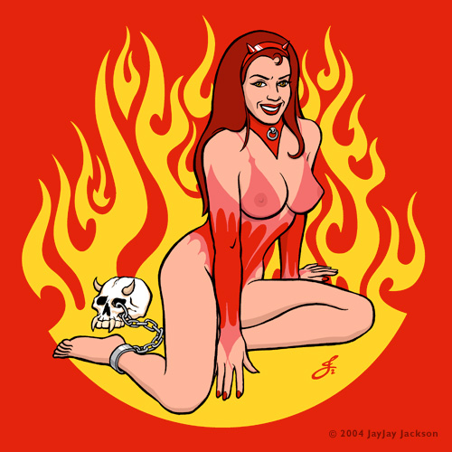
One thing I try to infuse into all of the pin up girls I draw is a sense of the woman being in control, and having fun. My girls are not victims, even when they are chained. They are avid participants in, what I hope is, sex-positive imagery. I find the popular fad for sad, sexualized child-women in gothic and outsider art very unpleasant and I consciously avoid any hint of that in my own work.
Once the poster was done and I got final approval from the band I arranged to have it screen printed. Luckily the band was willing to come up with the money to have Diesel Fuel do the job. They are very good. I did the separations and supplied some pantone colors for them to shoot for when mixing the inks and sent the artwork off over the internet. No more Fed Exing or mailing artwork... I love it. Things are so much easier now. An artist who remembers how things used to be can’t help but marvel at it.
I am a member of the gigposters.com web site for poster artists and fans and I upload all of my posters to the site. And the Six Feet Under poster won the Poster of the Week award! Which is very exciting. It also helped with sales and got loads of attention which led to doing more posters. So that was very nice! If you are interested in owning one of the Six Feet Under posters, we still have a few left, here on the Deaths Head Designs page.
Next: Finally, a good opaque water-based white ink!


No comments:
Post a Comment
Note: Only a member of this blog may post a comment.