Saturday, January 29, 2011

Birth of an Award-Winning Poster

A bit of my creative process.

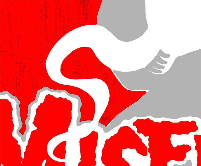
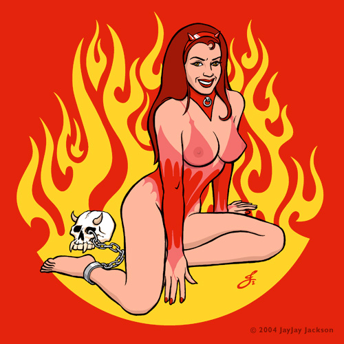
Got the job one day to do a new poster for Leviathan, the number one band I did posters for. They were opening for Six Feet Under, death metal band extraordinaire. I had been doing some sexy pin up girls on the posters for that band, so I thought I would do another one. The name of the band, Six Feet Under, does suggest a death-oriented theme so a sexy, deadly pin up girl was one idea I had. I love horror movies and every once in a while the girl ISN’T the victim. lol. So I settled on the idea for a girl with a bloody axe who may have just gotten some guy ready to be put six feet under. It turned out to be one of my most successful posters.

I had pitched the idea to the band and gotten a go ahead on it. I played around with some loose sketches and looked at my girl photo reference files to see if I could find a good pose. I like to collect old photos from the 40’s and 50’s. Mostly I like the coy, flirtatious body language and the weight of the women more than the modern look. I find that the women in most modern photos are too thin to look sexy to me, I'm repulsed by breast augmentation surgery and the body language is totally different. A sort of forced, self conscious sexuality that lacks that sense of fun many of the older pin ups have. I also like the quality of the light in the older photos. So I found a photo that had a nice pose and attitude to base my drawing on. I generally don’t stick too close to the photo reference, but use it as a guide to help me make the pose and proportion believable.

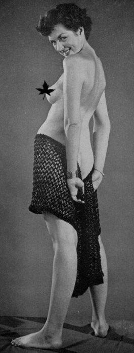
I got my boyfriend to take photos of my own hands holding a hammer behind my back to help get the hands right. Hands are difficult for me so I really have to work at them. But I can’t show that photo because I’m not uploading a photo of MY bare butt. lol. The drawing worked out pretty well and I inked it. I actually did the blood on the ground separately on another sheet of paper because I didn’t plan ahead and ran out of space on the first sheet. Since getting used to working with the computer, I sometimes work kind of rushed and sloppy and just fix things later. I figure the end product is what matters. I don’t like to sell my original artwork so I don’t go into a job with the idea of producing the art for a secondary sales market. Many people do, and that’s just fine. I guess I just can't wait to see the final result so I'm always in a rush to get to that point. Besides, technique isn't what matters on posters like this as much as it would on a painting. So, I scanned everything and put it all together in Photoshop and cleaned up the line work.

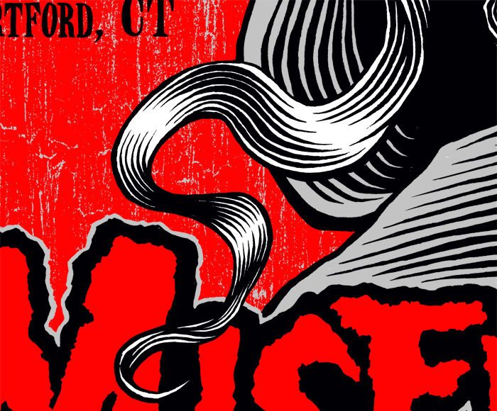
I knew I wanted two of the colors to be black and red, but it took a little experimentation to decide on the aqua blue. Once I tried that I liked it immediately. The icy coolness seemed good for a beautiful axe murderer. And the aqua has a nice vibration against the red, since it's close to the compliment on the color wheel.

One thing I try to infuse into all of the pin up girls I draw is a sense of the woman being in control, and having fun. My girls are not victims, even when they are chained. They are avid participants in, what I hope is, sex-positive imagery. I find the popular fad for sad, sexualized child-women in gothic and outsider art very unpleasant and I consciously avoid any hint of that in my own work.

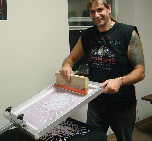
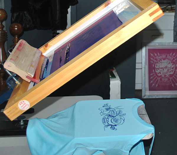
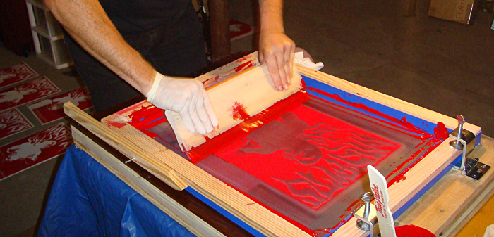
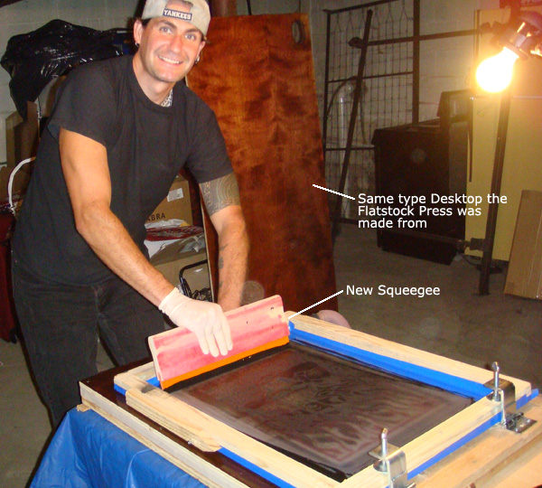
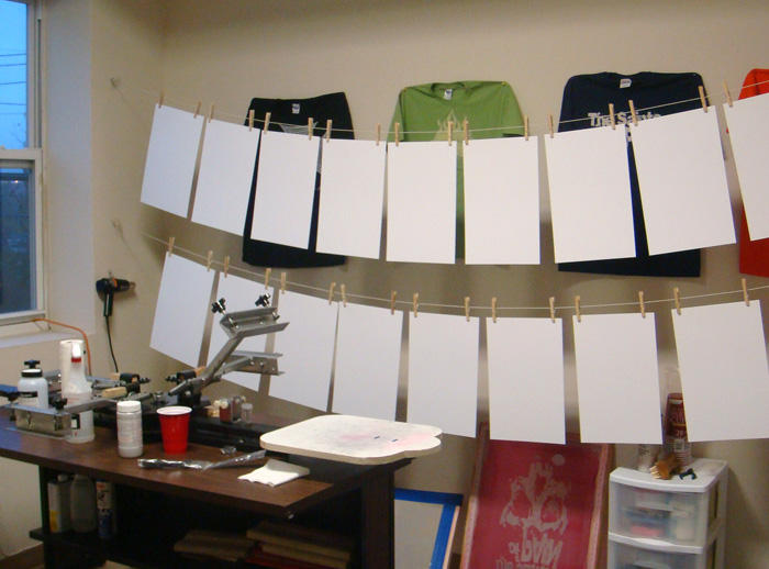
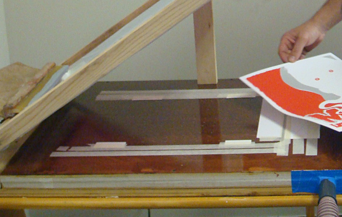
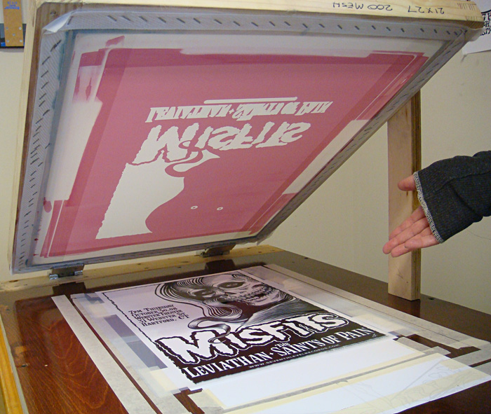
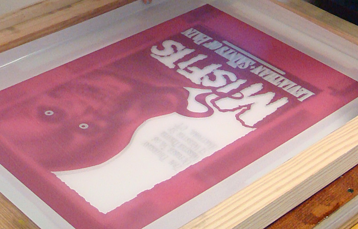
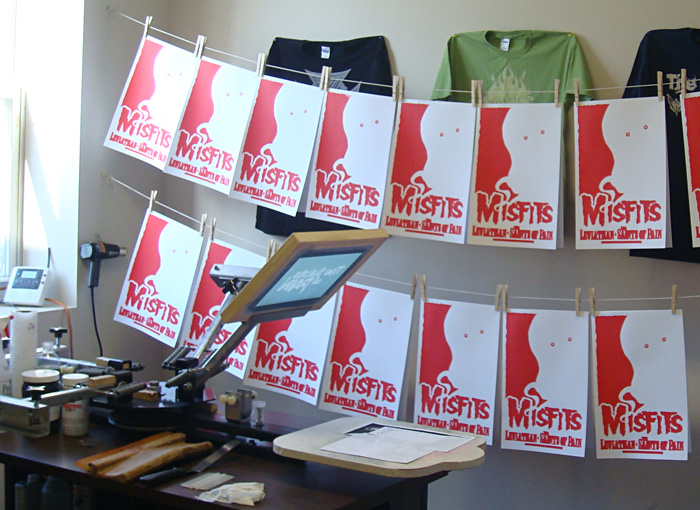
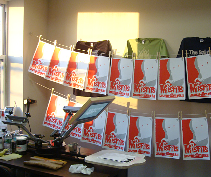
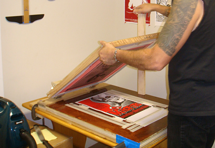
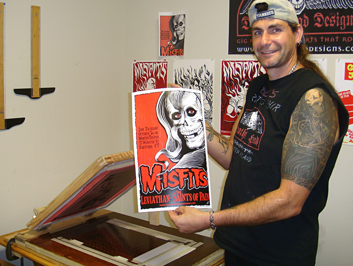
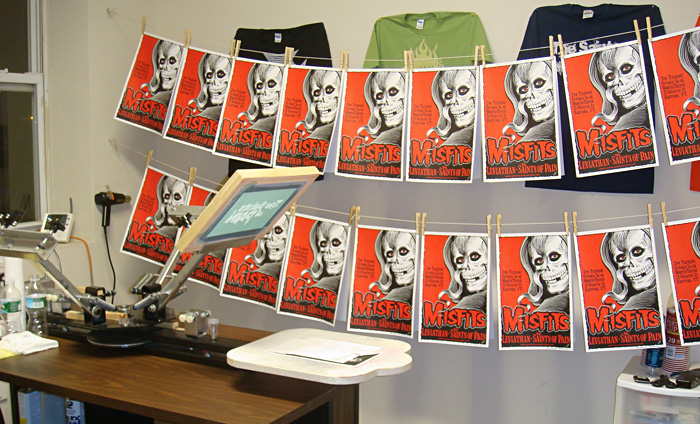
Once the poster was done and I got final approval from the band I arranged to have it screen printed. Luckily the band was willing to come up with the money to have Diesel Fuel do the job. They are very good. I did the separations and supplied some pantone colors for them to shoot for when mixing the inks and sent the artwork off over the internet. No more Fed Exing or mailing artwork... I love it. Things are so much easier now. An artist who remembers how things used to be can’t help but marvel at it.

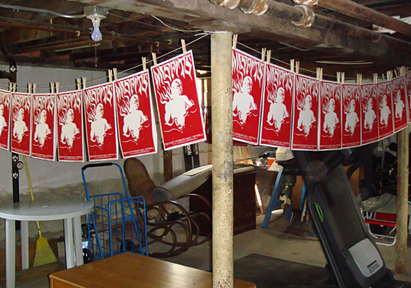
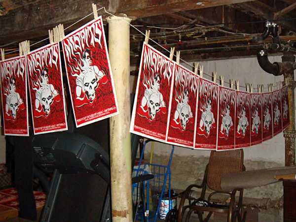
I am a member of the gigposters.com web site for poster artists and fans and I upload all of my posters to the site. And the Six Feet Under poster won the Poster of the Week award! Which is very exciting. It also helped with sales and got loads of attention which led to doing more posters. So that was very nice! If you are interested in owning one of the Six Feet Under posters, we still have a few left, here on the Deaths Head Designs page.


Next: Finally, a good opaque water-based white ink!

Thursday, January 27, 2011

10 Things Never to do While Screen Printing Water-based inks and Discharge inks


Don’t stop, slow down or take a phone call or Twitter break. Keep printing. If the ink dries in the screen it’s trouble. If you do have to stop you can try wrapping the screen with plastic wrap. We've tried that with mixed results. And by mixed, I mean not really successful, but others have reported better results.

Don’t put too much ink on the screen. It will start to dry up and become gloppy, to use the technical term. If you put too much ink on the screen at once it may become thick and uneven and be hard to get through the screen mesh.

Don’t put too little ink on the screen. Be sure there’s enough for a good back flood stroke to protect the ink from drying in the image you’re printing.


Don’t leave your ink container open. Keep it covered as much as you can so the ink doesn’t get gloppy or dry up on the edges.

Don’t print too many different colors unless you are pretty experienced at it. The more colors you are printing, the more time the ink has to dry up in the screens. But it depends on the ink. Some inks dry more slowly. We do 3 colors pretty well with Aerotex inks. 4 not as well. We’re getting better.

Don’t zone out. Go carefully, keep checking your work and making sure no problems are cropping up and you can avoid expensive mistakes. In screen printing, mistakes generally cost.

Don’t guess at curing temperatures. Buy an infrared thermometer gun. We try for around 325 or 350 degrees for discharge inks and also for water based.

Don’t rely on your memory. Make notes. Write down exposure times, inks used, mesh counts, what worked right, ideas, inventory, everything.

Don’t wait to wash out your screen after you finished printing. Get some water onto that thing right away. And if you start having drying problems during a run, mist the screen (on the ink side) with a light mist of water.

Don’t think you can get away without test printing. Always test print if you are doing something for the first time, or haven’t tried something in a while.


But, DO have a good time making cool stuff and especially enjoy wearing your beautiful and very comfortable eco-friendly creations!

Model Tony Robinson, actor and artist, enjoying the shirt we made especially for him. Check out his work here.
The Liberal, Born to Raise Issues shirt is available here.

Next: Birth of an Award-Winning Poster

Saturday, January 22, 2011

Why Screen Green?

Trying to get people to stop using toxic chemicals is like trying to convince someone to quit smoking. Until they encounter a problem with it, the problem just isn’t real to them. And just like smoking, it can take a long time for toxic chemicals to affect a person’s health to a noticeable degree. Unfortunately once it has affected your health, it’s usually too late. At that point you have to do damage control.


Pollutants and chemicals in the home and in our immediate environment are turning out to be more dangerous to our health than was ever realized. And what has that got to do with screen printing?

To quote Ronald Fuchs and Michael McCann, Ph.D., C.I.H.

“Silk screen printing is one of the most hazardous processes in the arts and crafts. Dermatitis, narcosis (dizziness, light-headedness, fatigue, nausea, lack of coordination and headaches), eye irritation, adverse reproductive hazards including increased risk of miscarriage, and serious neurological problems can all result from the processes of screen printing. Traditionally, silk screen printing has been performed using organic solvent-based materials. Water-based inks containing less hazardous ingredients provide a safer and increasingly popular alternative.”

Read the full article here:
http://www.uic.edu/sph/glakes/harts1/HARTS_library/silkscrn.txt

We didn't want to use plastisol inks because I just didn’t like them. I find the heavy plastic on a shirt uncomfortable and unappealing. But it turns out there’s more to be concerned about. A major health concern about plastisol inks is not only that they are PVC-based but that they contain phthalates. There’s been a lot in the news in recent years about phthalates and quite a bit of research into possible problems. Medical research has linked high doses of phthalates to damage to the liver, kidneys, lungs and testes in rats. Another medical study suggest that phthalates contributes to allergies in children. Many people, like me, choose not to wear plastisol screened clothing which comes into close, extended contact with your porous skin.


What many screen printers don’t realize is that there are better alternatives to doing things the old-fashioned toxic way.

Ways to do Greener screen printing

- Use an inkjet printer for your transparencies. Inkjet printers are greener than film output and are cheaper.

- Use water-based or discharge inks. Check into what is in them. You could even look into the new phthalate-free plastisol inks if plasitisol is what you want to use.

- Know what you are buying. Do the research. Have Material Safety Data Sheets for all of the products you buy and read them. Then use good judgement about what products you use.

- Use water-based screen printing adhesives, like Pro Bond or Tex Tac instead of solvent-based aerosols like Mist. These cost less, a LOT less as it turns out, and work better also. I switched while doing research into how to make our business greener.

- Use eco-friendly cleaners. The ones we use work better than their toxic counterparts.

- Buy shirts with recycled content or at least organic cotton. We are loving Anvil's new recycled cotton blend shirts we've been testing out.

- Put a simple filter, even one just made with a pieces of screen or cloth on the drain of your washout booth or slop sink. This will help stuff like emulsion from clogging your drains as well as protecting the water system.

- Think about ways to recycle and also ways to reuse old stuff. I wrote up a bit of what we have done here on the Deaths Head blog.

- Be careful, plan ahead and make fewer mistakes. Fewer mistakes reduces waste and saves you money. It can be done.

Extra Reading:
Here’s a very good article on the subject by the author of one of the best books out there on the subject, Water-Based Screen Printing Today
http://www.nontoxicprint.com/screenprintingbasics.htm

Next: 10 Things Never to do While Screen Printing Water-based inks and Discharge inks

Monday, January 17, 2011

Troubleshooting Screen Problems

This is a run down of common problems with coating, burning, washing out and reclaiming silk screens for printing.

Problem 1. The emulsion does not go onto the screen smoothly and evenly.

A. The mesh may have loosened up and have uneven tension. This is especially a problem with wood frame screens once they start to get old.
B. Your emulsion may be old or have dried bits that have fallen into it. Keep the emulsion container clean and try to refrigerate it if you are not going to use it up pretty quickly. Check the shelf life of the emulsion you are using.
C. Have you remembered to remove the rubber edge protector on your scoop coater? Don't laugh! You’d be surprised how many people make this mistake.


Problem 2. Emulsion is washing out all over the screen.

A. The screen was not exposed for a long enough time. You may have to experiment to get the right exposure time for your equipment and screen.
B. The emulsion was applied too thickly on the screen and not exposed long enough to overcome the thickness.
C. The emulsion may have been applied unevenly. The thicker patches may wash out and the thinner areas may be ok. If the emulsion is applied unevenly the thicker areas take longer to expose than the thinner areas, so you won’t get a good exposure on the screen.
D. The lights in your exposure unit may be getting old and losing their potency.
E. The emulsion was not cured. Make sure you allow enough time for the emulsion to dry completely and cure in the screen.
F. Too much water pressure can cause the emulsion to wash out and you should only use cold or lukewarm water.


Problem 3. It’s hard to wash out the image on a screen you just burned.

A. The emulsion on the screen could be old. When a screen has been coated and sits around too long, the emulsion gets harder to wash out.
B. The screen may have been exposed to some UV light. If there’s been too much light exposure to the screen the image area could be partially exposed and hard to wash out or may wash out unevenly.
C. Your image on the transparency may not be solid black. If the transparency lets light through the image area can become slightly exposed. It’s possible to double your transparencies, just be sure to line both copies up carefully.


Problem 4. Losing fine detail when you burn screens.

A. The transparency may not be making good contact with the screen. Make sure you place the transparency with the print side next to the screen and weight it well enough to make good contact. A vacuum exposure unit is best, but if you don’t have one of these you have to be more careful.
B. The screen is over-exposed. If the exposure is too long, the fine detail will not wash out and will be lost.
C. The light you are using to expose the screen is not angled correctly. The light source needs to be as straight on as possible, in other words, 90 degrees to the screen.
D. The light source may be too weak. If you are using a weak light source and a long exposure there is more risk of ambient light or light scattering contaminating the exposure.


Problem 5. Pinholes in the screen.

A. The glass over the lights may be dirty or have dust on it. Same with the transparency. Be sure to clean the glass before you burn a screen and the transparency before you tape it onto the screen.
B. Dust or dirt could have blown onto the screen while the emulsion was wet.
C. The emulsion may not have been completely cured.
D. If you do get pinholes and they aren’t too big, you can either cover them with tape or you can use a screen touchup pen or fill them in with a little more emulsion and let it dry and expose it to UV light to harden it.


Problem 6. The emulsion breaks down while you are screen printing.

A. The emulsion may not have been exposed long enough. We expose the finished screens to UV light after they are burned and washed out and have dried. Either with sun light or placing the screen back onto the light unit.
B. The emulsion is applied too thinly on the screen. The emulsion should be thin and even, but coated at least once on each side with a good scoop coater.
C. The emulsion may not have been properly cured. We usually allow a minimum of 24 hours for a screen to dry.
D. Wrong type of ink for the emulsion you are using. We use dual cure emulsion that works with both water-based and plastisol inks, but choose your emulsion carefully and check to make sure it works with the ink you intend to use.
E. Too much squeegee pressure or screening too many prints can cause the squeegee to wear down the emulsion. Be sure to use the correct emulsion for the type of ink you are working with and coat the screen an extra time on the inside of the screen where the squeegee will make contact if you will be screening a large number of impressions.


Problem 7. The screen is hard to reclaim.

A. The emulsion on the screen may be old. The longer the emulsion sits on your screen, the harder it is to reclaim.
B. The reclaiming solution dried in the screen. Once the reclaiming solution dries on the screen, it becomes permanent and ruins the screen. Always be careful to wet the screen before you apply the reclaimer, keep it wet and work the reclaimer around on the screen with a brush or scrubbie.
C. The emulsion may be uneven. If the emulsion is thick in spots, like around the edges, it may be hard to get all of the emulsion out. Though if it’s only on the edges, it may not matter.
D. You may not be using enough water pressure. Try using a pressure washer, a special hose like the one Victory Factory sells or even try a coin-op DIY car wash.
E. Ink may have dried in the screen. If the ink was not washed out thoroughly it may have dried in and blocked parts of the mesh. You can try a haze remover like Enviro Haze. But if the ink has really dried in there, the screen may be ruined.


Here is a handy chart from Speedball that I found. It may help with estimating exposure times if you are using light bulbs.


Next: Why Screen Green?

Saturday, January 15, 2011

Rocking the Basics Part 2 - Water Based and Discharge Inks

Just Watch the Videos! How Easy is that?

There are many videos and tutorials out there about the basics of silk screen printing. You can check youtube.com, vimeo.com. Instructables.com, wikihow.com and ehow.com are all places you can find some information on the basics or on different techniques for screen printing or decorating clothing.

Here are a few water based and Discharge inks videos excerpted from the Ryonet DVD. I recommend the DVD. It has helped us learn.


Mixing Discharge ink (Note: They say the ink is good for 8 hours but we notice a drop off in print quality after 4 or 5 hours)


Discharging the Discharge ink on shirts.


Clearing dried water based ink (We use the RC water-based inks, they are very good, but the ink will dry in the screen sometimes)


Enviro Wash Screen Cleaner (We use this and it’s great)


I really couldn’t find anything good on using Discharge Paste, which we use quite a lot. I think we will have to make one. If you would like to look over my blog post on Discharge Past here it is.


Extra stuff:

Recession advice for screen printers (Don’t have a job? Make your own!)


Got a Yudu? Here’s a nice tip:
Coat Your Yudu Screens With Liquid Emulsion

diyteeshirts.com YUDU Hacks: Coat a Yudu Screen from DIY Teeshirts on Vimeo.


Next: Troubleshooting Screen Problems

Wednesday, January 12, 2011

Rocking the Basics Part 1 - Coating and Exposing the screens

Just Watch the Videos! How Easy is that?

I haven’t covered the basics of screen printing because so many other people already have. There’s a ton of information out there that has helped us so I’m just going to link a bunch of it here! Sit down with some popcorn and watch!

Ryonet has many good videos on youtube and they sell excellent DVDs. Catspit Productions has some great videos. The only drawback (for us) is that Catspit only prints with toxic Plastisol ink. We don’t use that ink very much, only on one type of shirt, our UV reactive shirt, prefering to stick to more evironmentally friendly products. But they are a great source of DIY information. Basically, you can find most any type of beginner information on youtube.com. You can find a master list of the stuff we use here.

Prepping And Coating Screens
We don’t degrease or abraid the mesh. I know you’re supposed to, and we did at first, but then we found we didn’t need to after all. You have to find what works for you.


Putting emulsion on your screen
We mostly use one coat on each side. We also work in normal room light, fluorescent or 60 watt incandescent, but we are using dual cure emulsion. We just put our screens in a big cardboard box with a black cloth draped over it to dry and we separate them with votive candles or small jars in between the screens. But the storage closet is nice!


Another - How to Put Emulsion on Your Screen
(Nice one!)


Placing Your Film On The Screen


Image Placement on the Screen and Screen Exposure

Click to Watch

How to Burn a Screen
Good information and a cute girl! We basically do things much this way but we use dual cure emulsion, expose the screen for 5 minutes and do all of this in low normal room light, but no sun light.


A couple of different ways to expose your screens


Screen Exposure Problems PART 1


Getting Your Art To Screen


Washing Out The Stencil & Reclaiming
We dab our screens dry with a paper towel and sometimes dry it further with a hair dryer, NOT held too close because nylon mesh can melt. We also use a special hose from Victory Factory instead of a pressure washer. A pressure washer is better, but you can get along with less.


 Here is a Speedball exposure chart that may help when exposing screens using light bulbs.


Next: Rocking the Basics Part 2 - Water Based and Discharge Inks

Tuesday, January 11, 2011

The World’s Most Painful Poster

I know I keep mentioning this poster. Our first. Oh, the horror. The first time we tried to screen print a poster it was a whirlwind of trouble. One weekend of pure hell. If this project didn’t make us give up, nothing will. But I will explain all of the problems that we had and maybe that will help if you run into problems.

Before Freddy and I started screen printing, I had designed some posters and had them printed by several different screen printers, all of whom did a wonderful job. But it was time to do our own. We started small. Our first poster was 12” x 18” and 2 colors.

It started out just fine. I took some photos of Freddy posing with a skull I had laying around the house and did the sketch, inked it and did the separations, planning on a simple 2 color poster in classic red and black. Freddy got the poster press built and ready in time for the weekend printing session. We had the screens made for us at Standard Screen in Manhattan since we weren’t experienced at burning screens yet.

The posters I had drawn before were silk screened by other people and I had always done the separations myself. I was very sure to make the posters pretty easy to screen and give the screen printers good separations. But on this one, I got lost in the creative process and created a bit of a difficult registration issue. I did something that is generally not a good idea and had 2 colors need to line up precisely to look right. Below is an example of what I mean. The top picture is the black screen out of register and the bottom picture shows it correctly in register.

The press Freddy built is capable of very accurate registration... when it is working right. Anyway, I had done all of the research on printing posters so we began, thinking we knew what we were doing. We hung the paper up in the basement overnight to let it acclimate so that it wouldn’t change shape on us as it absorbed the humidity or changed temperature.

We started on our adventure. We ran into trouble almost right away. We could not get a good print out of the red screen. Below are some examples of the problems we had.

Here the ink squeezed out under the screen. And perhaps you can see that the texture of the ink is blotchy, not smooth like it should be. The ink we were using was too thick and needed to be thinned, but we did not know. We used the Speedball acrylic ink right out of the jar. Freddy had to press so hard to get it through the screen that it bled under the masked areas. And it was so sticky that it stuck the screen down to the paper and didn’t pop back up like it should even though we increased the off-contact (or space between the screen and the paper). Now we know that it may have been possible that the ink was spreading out under the stencil like that BECAUSE we increased the off-contact. Sigh.


We also had problems with the ink not going on evenly and skipping some areas. Usually the same areas. We would later discover that we had a bad squeegee.

Here’s an action shot at our low point with the bad squeegee, bad ink and bad hinge clamps.

We tried to clean the screen out on the press after it would squeeze out like that, but it didn’t work. We would have to take the screen off and go wash it up and wait for it to dry. During one of these breaks, we re-watched a Speedball DVD we had and realized that perhaps the ink was too thick. So we thinned the ink to the consistency we had seen on the DVD and tried again. It was still hard and we ruined a lot of paper, but we finally got 60 good prints. It seemed like it took forever.

Once the red prints dried, we started trying to print the black screen. It was going worse than ever and now we were ruining some of the red prints we had screened. About that time, while we were cleaning up the screen for another try, Freddy noticed that the squeegee wasn’t straight. It had a slight curve on one end. That was one problem. He also felt like the black ink was too thinned out. So we found another squeegee and I mixed another batch of ink, thicker this time and we started again.


Everything was going wonderfully... until we noticed the black was going out of register. It wasn’t lining up and it was different on every print! We found the problem – the hinge clamps weren’t holding the screen tightly and it was slipping around. No matter how we tightened them with pliers and even vice grips, they would still loosen up.

So we took the Staten Island train to the Staten Island Ferry to (oh god why did I move to Staten island? Oh yeah, a house & basement.) Manhattan and then took the subway to the art supply store to buy the good hinge clamps that we should have bought in the first place. Sigh. But we hadn’t known. Buy Jiffy Clamps. Trust me on this. Here’s a picture. The Jiffy clamps and a discarded old, bad clamp.

We mounted the new Jiffy Clamps and screened the rest of the black. At that point we were amazed at how easy it was. We finished screening the posters and they came out beautifully. We even managed to print my tricky registration with very little trouble at that point.

We finished up and hung the prints to dry. We celebrated our victory by watching a silly horror movie... somehow fitting.

Rawk!

Saturday, January 8, 2011

How to Do Color Separations for Screen Printing in Photoshop

Also Scanning Line Art
Note: The information here is for people with some familiarity with screen printing and computer graphics, specifically Adobe Photoshop.

Here are a few examples of how I do color separations for silk screened posters in Photoshop. Of course, you can do color separations by hand and cut the film, but I did that for way too many years before we had computers. So screw that. I’ll give up my Adobe Photoshop when they pry it from my cold, dead fingers. Still have a bunch of Rubylith in a box somewhere. You can have it.

To start with I draw my art by hand. In case you are wondering, I sketch the drawing and transfer my sketch to Graphics 360 Marker paper with a mechanical pencil, tightening the sketch as I transfer it, and then ink it with markers, mostly Pigma Micron. Both the regular markers and the brush markers. I don’t use white out. If I make a mistake, I usually draw the correction right through the mistake and fix the line art in Photoshop. I'm not trying to produce an original masterpiece, just a good final product and fast is better.

Once the art is finished and the pencil lines erased, I scan it at a pretty high resolution in Black & White Grayscale mode. The resolution depends on what size I drew the art. I have a pretty tight drawing style so I sometimes draw the art smaller than the finished print size and scan it at 600 pixels/inch. If the art is closer to the final size I might use 400 pixels/inch.

I scan it in Grayscale, import it into Photoshop and use Image > Adjustments > Threshold to change the image to a bitmap and eliminate the anti-aliasing that makes the lines fuzzy, playing with the setting to get the line weight I want. If the line art is too light I will use the Brightness/Contrast adjustment to darken the lines before I use the Threshold adjustment. Once the art is totally black and white with no grays I touch up the art with the pencil tool to keep the hard edge on the art. Keeping the edge non-anti aliased makes selecting the lines easy and doing the separations easy and accurate. I do the separations in either RGB or CMYK mode. If you are printing the seps out on an inkjet printer like we do, it doesn't matter much.

Here’s a scan of some line art before it was touched up. Scanned at 600 pixels/inch. You can see some of the mistakes I made in the inking.

Here’s a closeup of the line art after it’s been touched up. The final resolution ended up being 372 ppi at print size, 18” x 22”.

Here’s the final color art that was separated for screen printing.

Here’s an animation of the 4 color separations.

For the Misfits poster described in my last blog post, I drew the line art and later decided how to color separate the colors. I had a pretty good idea of how to color it, but it wasn’t totally planned. Here are some possibilities I tried out. The last one is the one I decided on:

That last combination of colors made parts of the separations slightly complicated. Here’s the line art I started with.

Here are the separations for that poster with the black line art grayed out a bit so you can see the overlap of the other colors, the red and the gray.

Here are some detail shots of part of the poster. This is all three colors with the black lines grayed out some.

This is just the gray and the red without the black lines.

This is just the black and the red with the black lines grayed out.

This is all three colors as it would print.

Sometimes doing color separations is easy. Below is a detail of a poster I did for a Viking Kings show. I drew the black line art and mostly just had to fill in the colors.

Here’s the same detail with the black lines grayed out.

To do the seps for this Viking Kings poster, I just selected the open areas with the Magic Wand Tool in Photoshop, with anti aliasing turned off (unchecked). Once I had the areas selected I went to the Select menu and used the Modify > Expand to make the selection larger and then filled the area with color on a new layer (Edit > Fill). I do the color separations in color at first and then fill them with black to print the layers on transparencies, since you need good solid black art to burn the screen. You can see on the detail above that there were a few areas that I had to draw the color in by hand, using the pencil tool, but most of it I was able to just Expand and Fill.

On the Misfits poster, there’s a good bit of outlining done by hand, but I take any shortcut I can whenever I can. I knew I would print the colors in the order red - gray - black and I did the separations for that order. Hopefully all of that is clear. If you get the concept, then the best way to explain it is to just show you what I did, hence all of the big pictures. The information is not for beginners, but if you would like more information or explanation, you can email me and I will try to answer your questions.

There are many other ways to do separations and I would urge anyone reading this to seek out more information and choose the way the suits you best. The best way to figure out the best way is to know all the ways.

Next: The World’s Most Painful Poster

Thursday, January 6, 2011

DIY Secrets to Printing Flatstock

How We Printed Our Three Color Misfits Poster

Though our first poster for The Misfits was a weekend carnival of horror and pain that scarred our delicate psyches for eternity, we got some beautiful posters out of it and we learned a lot. The next few posters we tried came out better. We kept learning. So the next Misfits poster was a three color poster for the Halloween weekend show in Hartford, CT. At the show the posters were our biggest hit ever and sold out quickly. Jerry Only, who is always very supportive of our work, even came and signed them all. I will take you through the printing of that poster step by step.

I draw the art for all of our projects by hand and scan it at a high resolution, usually 400 or 600. That’s often higher than I need but it can come in handy for a variety of reasons. I bring the art into Photoshop, touch up the line work (because I’m picky) and do the color separations on separate layers. I print out each layer on a large format inkjet printer (Epson Workforce 1100) on transparency film and use the film to burn the screens making sure to place the image in the same position on each screen. That makes it possible to line up the screens on the press. We used 200 mesh screens for this project. The equipment and chemicals we use are covered in the master list.

All of these steps could have their own explanation, and I will possibly go into detail about some of that in the future, but things like art, scanning, burning screens, etc. are pretty basic and covered in many other places. I’ve been concentrating on the things we do that are less unusual.

So at the point this tale of edification begins, I have the poster press we built, 3 prepared screens and the paper we will print on. One thing – if you are doing more than one color on your poster, you will need to start the project the night before you will screen print and hang or lay out the approximate amount of paper you will need. Paper can change shape with humidity and temperature so you want it to equalize over night or at least for a few hours so that it doesn’t change shape during your print run and affect the registration of your colors. I generally have about 1/16” overlap of the colors on the separations. That’s usually enough. I will do a more detailed write up on color separations next time.
The paper was hung up overnight:

This Misfits poster was printed in 3 colors of acrylic screen printing ink for paper – red, grey and black. In most cases you would want to print the colors in order with the lightest first to the darkest, last. In the case of this poster we didn’t exactly do that, but close. We printed the red first and then the grey even though the grey is a tiny bit lighter. The colors are semi-opaque and my theory was that the grey would over print the red in some spots and we would have areas of light grey where it overprinted the white paper and darker grey where it overprinted the red. But the ink we used was actually more opaque than I figured so the effect is very subtle. We had gone all over New York City to art supply stores to find just the right red acrylic ink we wanted and then I had to mix the grey from white and black.

To start with I laid a sheet of the poster paper (Cougar opaque white 100# cover, that we had cut to the finished poster size for us at Limited Papers) in the middle of the vacuum table of the press and turned on the vacuum to hold it in place. I had cut some rectangular pieces of paper out of one of the sheets of poster paper to make guides and I taped these around the sheet of poster paper to mark where I would place the paper each time. I placed the guides right up to the edge of the paper sheet so that every time you placed a sheet of paper on the press it would fit right into the guides and be in the exact same spot. The sheet of paper fits into the guides kind of like putting a piece of a jigsaw puzzle in place. I used guides on three sides of the paper. Not everyone does. Some people use only three guides on two sides. Which is called three point registration. But since our paper gets a bit wavy when we print on it I wanted the extra points of registration.
The guides:

I use the same paper as the posters will be printed on for the guides so that there is no unevenness under the squeegee as it is pulled across the screen. I tape the guides down with a low tack masking tape that doesn’t leave a residue. I use the tape and some more paper to cover all of the holes that won’t be used to hold down the paper sheets we will print on. That way the vacuum won't suck your screen down onto the table, ruining your off contact and is concentrated on the paper sheets we want to hold in place.

Next I centered the design we will be printing on the paper using the transparency film I burned the screen with. I used the black film in this case since it has all of the line art and I can register all of the other colors to it. If a design is hard to register I will use registration marks, but in this case the colors were easy to register to each other (and I did the art myself and was familiar with it, which helps), so I didn’t bother. I taped down the transparency in position on top of a sheet of blank paper and used that to position the screen. I carefully lined up the screen over the design, pressing down to make sure it was exactly in place over the line art and then tightened the clamps, making sure the screen didn’t pull out of register as we screwed the clamps tight.
Here is the tranparency film taped on the sheet of paper laid into the guides:

Lining up the screen for the first color, red:

Then we screened the first color, red. We used the ink right out of the jar. We didn’t need to dilute the ink and I didn’t mix it with a retarder to slow the drying time. We haven’t found that necessary with the acrylic poster inks. We hung the posters on string with clothespins, putting 2 back to back to save space. You can also use a rack to dry the posters flat or just lay them around. Whatever works.
Screening the first color:

The first run of posters hung up to dry:

We let the posters dry about an hour or so to be safe. Drying times will vary so you just have to feel the ink and see if it’s dry. I mixed up the grey ink for the second printing, lined up the screen for the grey print on the same transparency taped to the same sheet of paper and we printed the second color. And let that dry the same way.
Ready to print the second color:

Printing the second color:

You can see we keep the vacuum in easy reach to switch it off and on:

The second run hung up to dry:

Same process for the last color, black. This time the screen was even easier to line up the screen since I was matching it to to the same art. The paper had gotten somewhat wavy by this time, but not so much that it caused a problem. The vacuum still held it down well enough to keep it from shifting and the print went on fine. Once the prints were dry we stacked them and put them in a case, and they all flattened out.
Printing the final color, black:

The finished poster:

Hung up to dry:

Next: How to Do Color Separations for Screen Printing in Photoshop.