Saturday, January 8, 2011

How to Do Color Separations for Screen Printing in Photoshop

Also Scanning Line Art
Note: The information here is for people with some familiarity with screen printing and computer graphics, specifically Adobe Photoshop.

Here are a few examples of how I do color separations for silk screened posters in Photoshop. Of course, you can do color separations by hand and cut the film, but I did that for way too many years before we had computers. So screw that. I’ll give up my Adobe Photoshop when they pry it from my cold, dead fingers. Still have a bunch of Rubylith in a box somewhere. You can have it.

To start with I draw my art by hand. In case you are wondering, I sketch the drawing and transfer my sketch to Graphics 360 Marker paper with a mechanical pencil, tightening the sketch as I transfer it, and then ink it with markers, mostly Pigma Micron. Both the regular markers and the brush markers. I don’t use white out. If I make a mistake, I usually draw the correction right through the mistake and fix the line art in Photoshop. I'm not trying to produce an original masterpiece, just a good final product and fast is better.

Once the art is finished and the pencil lines erased, I scan it at a pretty high resolution in Black & White Grayscale mode. The resolution depends on what size I drew the art. I have a pretty tight drawing style so I sometimes draw the art smaller than the finished print size and scan it at 600 pixels/inch. If the art is closer to the final size I might use 400 pixels/inch.

I scan it in Grayscale, import it into Photoshop and use Image > Adjustments > Threshold to change the image to a bitmap and eliminate the anti-aliasing that makes the lines fuzzy, playing with the setting to get the line weight I want. If the line art is too light I will use the Brightness/Contrast adjustment to darken the lines before I use the Threshold adjustment. Once the art is totally black and white with no grays I touch up the art with the pencil tool to keep the hard edge on the art. Keeping the edge non-anti aliased makes selecting the lines easy and doing the separations easy and accurate. I do the separations in either RGB or CMYK mode. If you are printing the seps out on an inkjet printer like we do, it doesn't matter much.

Here’s a scan of some line art before it was touched up. Scanned at 600 pixels/inch. You can see some of the mistakes I made in the inking.

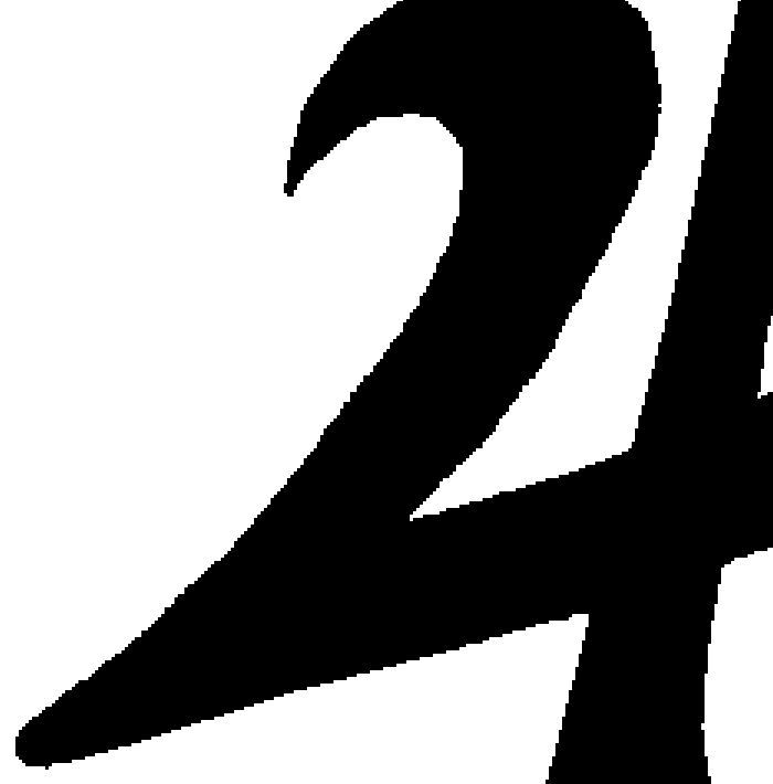
Here’s a closeup of the line art after it’s been touched up. The final resolution ended up being 372 ppi at print size, 18” x 22”.
Here’s the final color art that was separated for screen printing.

Here’s an animation of the 4 color separations.

For the Misfits poster described in my last blog post, I drew the line art and later decided how to color separate the colors. I had a pretty good idea of how to color it, but it wasn’t totally planned. Here are some possibilities I tried out. The last one is the one I decided on:

That last combination of colors made parts of the separations slightly complicated. Here’s the line art I started with.

Here are the separations for that poster with the black line art grayed out a bit so you can see the overlap of the other colors, the red and the gray.
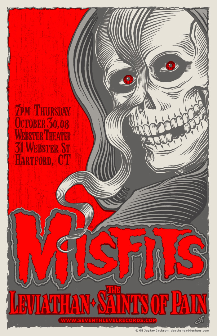
Here are some detail shots of part of the poster. This is all three colors with the black lines grayed out some.

This is just the gray and the red without the black lines.

This is just the black and the red with the black lines grayed out.

This is all three colors as it would print.

Sometimes doing color separations is easy. Below is a detail of a poster I did for a Viking Kings show. I drew the black line art and mostly just had to fill in the colors.

Here’s the same detail with the black lines grayed out.

To do the seps for this Viking Kings poster, I just selected the open areas with the Magic Wand Tool in Photoshop, with anti aliasing turned off (unchecked). Once I had the areas selected I went to the Select menu and used the Modify > Expand to make the selection larger and then filled the area with color on a new layer (Edit > Fill). I do the color separations in color at first and then fill them with black to print the layers on transparencies, since you need good solid black art to burn the screen. You can see on the detail above that there were a few areas that I had to draw the color in by hand, using the pencil tool, but most of it I was able to just Expand and Fill.

On the Misfits poster, there’s a good bit of outlining done by hand, but I take any shortcut I can whenever I can. I knew I would print the colors in the order red - gray - black and I did the separations for that order. Hopefully all of that is clear. If you get the concept, then the best way to explain it is to just show you what I did, hence all of the big pictures. The information is not for beginners, but if you would like more information or explanation, you can email me and I will try to answer your questions.

There are many other ways to do separations and I would urge anyone reading this to seek out more information and choose the way the suits you best. The best way to figure out the best way is to know all the ways.

Next: The World’s Most Painful Poster

Thursday, January 6, 2011

DIY Secrets to Printing Flatstock

How We Printed Our Three Color Misfits Poster

Though our first poster for The Misfits was a weekend carnival of horror and pain that scarred our delicate psyches for eternity, we got some beautiful posters out of it and we learned a lot. The next few posters we tried came out better. We kept learning. So the next Misfits poster was a three color poster for the Halloween weekend show in Hartford, CT. At the show the posters were our biggest hit ever and sold out quickly. Jerry Only, who is always very supportive of our work, even came and signed them all. I will take you through the printing of that poster step by step.

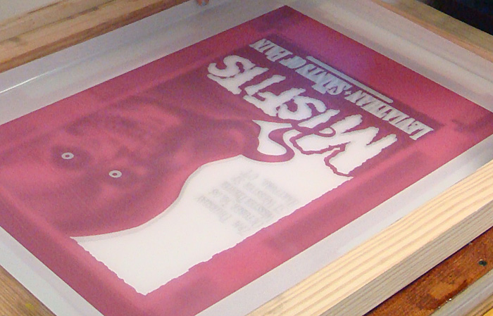
I draw the art for all of our projects by hand and scan it at a high resolution, usually 400 or 600. That’s often higher than I need but it can come in handy for a variety of reasons. I bring the art into Photoshop, touch up the line work (because I’m picky) and do the color separations on separate layers. I print out each layer on a large format inkjet printer (Epson Workforce 1100) on transparency film and use the film to burn the screens making sure to place the image in the same position on each screen. That makes it possible to line up the screens on the press. We used 200 mesh screens for this project. The equipment and chemicals we use are covered in the master list.
All of these steps could have their own explanation, and I will possibly go into detail about some of that in the future, but things like art, scanning, burning screens, etc. are pretty basic and covered in many other places. I’ve been concentrating on the things we do that are less unusual.

So at the point this tale of edification begins, I have the poster press we built, 3 prepared screens and the paper we will print on. One thing – if you are doing more than one color on your poster, you will need to start the project the night before you will screen print and hang or lay out the approximate amount of paper you will need. Paper can change shape with humidity and temperature so you want it to equalize over night or at least for a few hours so that it doesn’t change shape during your print run and affect the registration of your colors. I generally have about 1/16” overlap of the colors on the separations. That’s usually enough. I will do a more detailed write up on color separations next time.
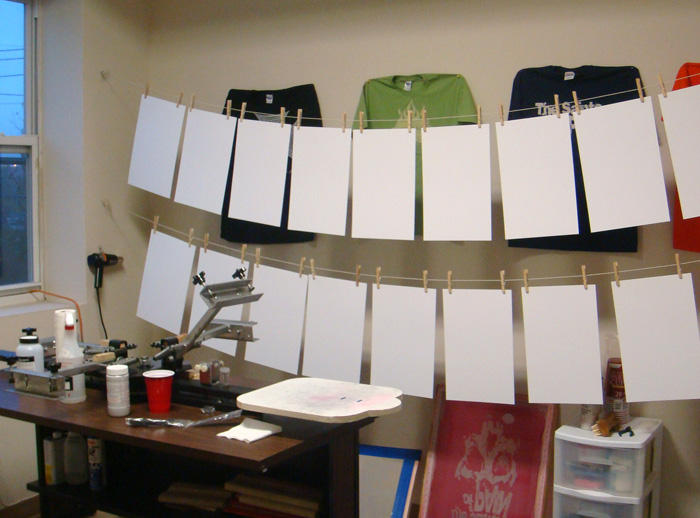
The paper was hung up overnight:

This Misfits poster was printed in 3 colors of acrylic screen printing ink for paper – red, grey and black. In most cases you would want to print the colors in order with the lightest first to the darkest, last. In the case of this poster we didn’t exactly do that, but close. We printed the red first and then the grey even though the grey is a tiny bit lighter. The colors are semi-opaque and my theory was that the grey would over print the red in some spots and we would have areas of light grey where it overprinted the white paper and darker grey where it overprinted the red. But the ink we used was actually more opaque than I figured so the effect is very subtle. We had gone all over New York City to art supply stores to find just the right red acrylic ink we wanted and then I had to mix the grey from white and black.

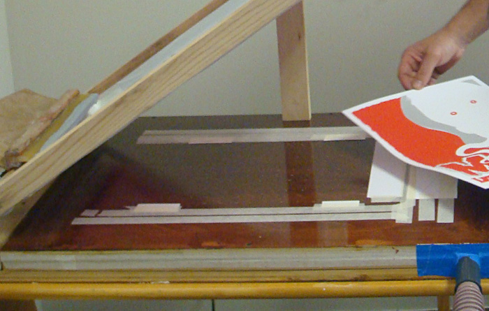
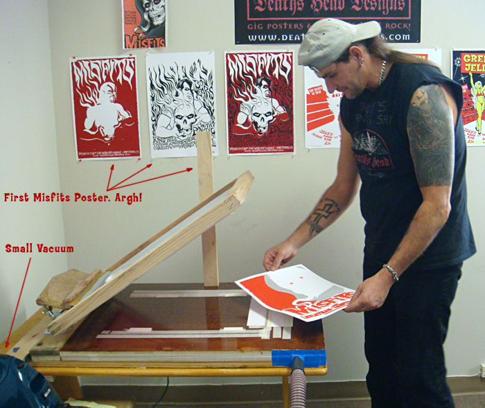
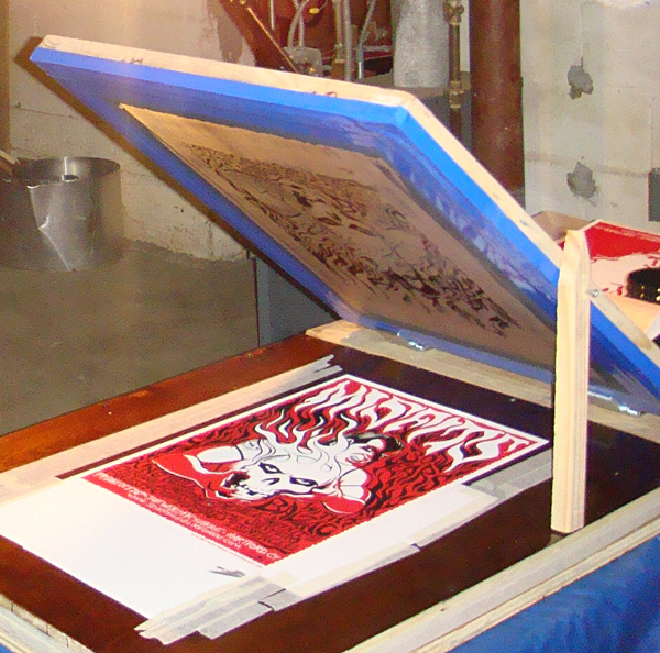
To start with I laid a sheet of the poster paper (Cougar opaque white 100# cover, that we had cut to the finished poster size for us at Limited Papers) in the middle of the vacuum table of the press and turned on the vacuum to hold it in place. I had cut some rectangular pieces of paper out of one of the sheets of poster paper to make guides and I taped these around the sheet of poster paper to mark where I would place the paper each time. I placed the guides right up to the edge of the paper sheet so that every time you placed a sheet of paper on the press it would fit right into the guides and be in the exact same spot. The sheet of paper fits into the guides kind of like putting a piece of a jigsaw puzzle in place. I used guides on three sides of the paper. Not everyone does. Some people use only three guides on two sides. Which is called three point registration. But since our paper gets a bit wavy when we print on it I wanted the extra points of registration.
The guides:

I use the same paper as the posters will be printed on for the guides so that there is no unevenness under the squeegee as it is pulled across the screen. I tape the guides down with a low tack masking tape that doesn’t leave a residue. I use the tape and some more paper to cover all of the holes that won’t be used to hold down the paper sheets we will print on. That way the vacuum won't suck your screen down onto the table, ruining your off contact and is concentrated on the paper sheets we want to hold in place.

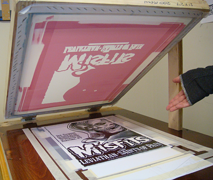
Next I centered the design we will be printing on the paper using the transparency film I burned the screen with. I used the black film in this case since it has all of the line art and I can register all of the other colors to it. If a design is hard to register I will use registration marks, but in this case the colors were easy to register to each other (and I did the art myself and was familiar with it, which helps), so I didn’t bother. I taped down the transparency in position on top of a sheet of blank paper and used that to position the screen. I carefully lined up the screen over the design, pressing down to make sure it was exactly in place over the line art and then tightened the clamps, making sure the screen didn’t pull out of register as we screwed the clamps tight.
Here is the tranparency film taped on the sheet of paper laid into the guides:

Lining up the screen for the first color, red:

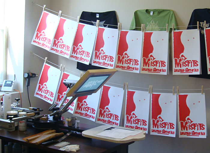
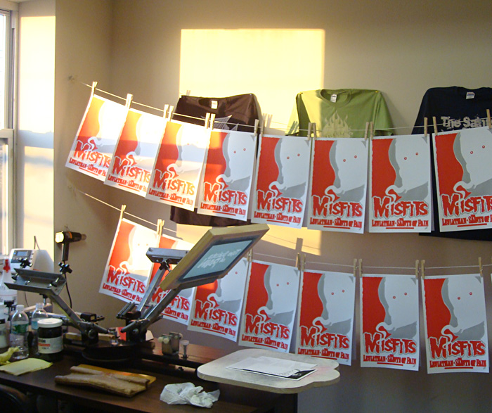
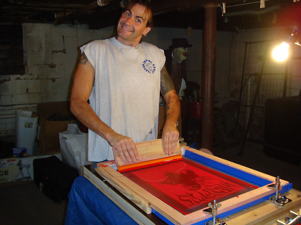
Then we screened the first color, red. We used the ink right out of the jar. We didn’t need to dilute the ink and I didn’t mix it with a retarder to slow the drying time. We haven’t found that necessary with the acrylic poster inks. We hung the posters on string with clothespins, putting 2 back to back to save space. You can also use a rack to dry the posters flat or just lay them around. Whatever works.
Screening the first color:

The first run of posters hung up to dry:

We let the posters dry about an hour or so to be safe. Drying times will vary so you just have to feel the ink and see if it’s dry. I mixed up the grey ink for the second printing, lined up the screen for the grey print on the same transparency taped to the same sheet of paper and we printed the second color. And let that dry the same way.
Ready to print the second color:

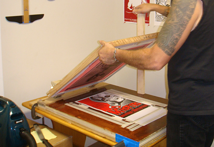
Printing the second color:

You can see we keep the vacuum in easy reach to switch it off and on:

The second run hung up to dry:

Same process for the last color, black. This time the screen was even easier to line up the screen since I was matching it to to the same art. The paper had gotten somewhat wavy by this time, but not so much that it caused a problem. The vacuum still held it down well enough to keep it from shifting and the print went on fine. Once the prints were dry we stacked them and put them in a case, and they all flattened out.
Printing the final color, black:

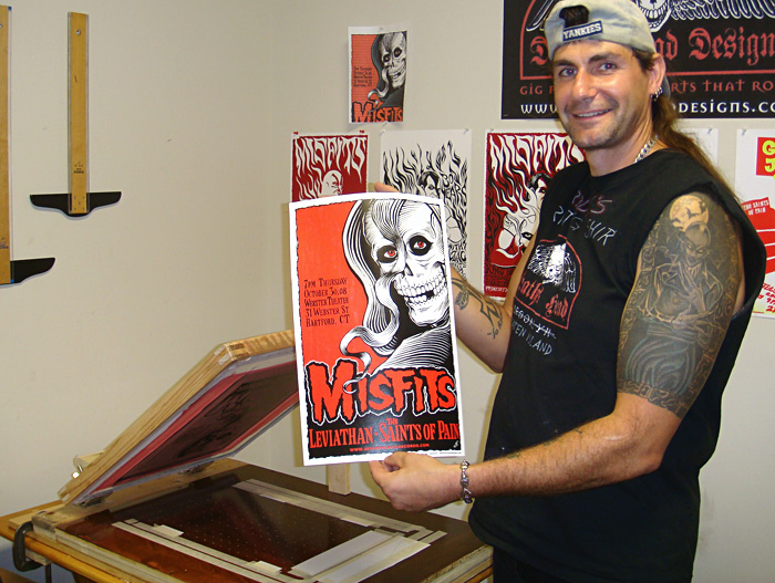
The finished poster:

Hung up to dry:

Next: How to Do Color Separations for Screen Printing in Photoshop.

Wednesday, December 22, 2010

Building Your Own Vacuum Table Poster Press

Silk screen your own art prints for fun and profit!

I had been doing posters for a while and having them printed by other people (very beautifully, I might add, but it was pricey) but I knew that I wanted us to try and print our own posters. I did exhaustive research (it’s what I do), looking on the internet and in books. I searched out different methods on building a poster or flatstock press and asked some experienced poster screen printers’ opinions. And I came up with the idea of how to build our press. We scrounged up most of the materials in Freddy’s basement. It’s pretty easy to build with some very basic woodworking skills and tools.

1. You need something to make the top out of that is smooth and flat. We used an old desktop. You can use a nice piece of birch plywood. You could use a piece of countertop. I’ve seen someone use a thick piece of plexiglass that had been an old sign. As long as it’s smooth, flat and thick enough that it won’t flex under pressure, it’s ok.
2. You need some 5/8” plywood to cut into 3/4" strips to make the spacers for the middle part.
3. You need something to serve as the bottom. We used a piece of scrap plywood that was hanging around the basement. Any flat board that’s big enough would be fine. Even a table top. We found a table someone threw out that we plan to use to build our next, larger, press onto. Recycle, reuse, etc.
4. You need a vacuum cleaner. I had an old canister one that works great for the press and isn’t too large and cumbersome.
5. You need some hinge clamps. We bought the wrong ones at first and they didn’t hold the screen securely. So then we got some Jiffy Hinge Clamps. They are very common. Should sell for around $20-25.
6. And you’ll need a t-square to draw the grid, one or two 3/32” drill bits, some screws, wood glue or contact cement and clamps for holding the thing together once it’s glued until it dries. The main thing is to use enough glue and put the press together tightly enough so that it doesn’t leak air. Ours leaked air at first. We found the holes and filled them with glue. No big deal.

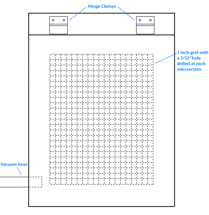
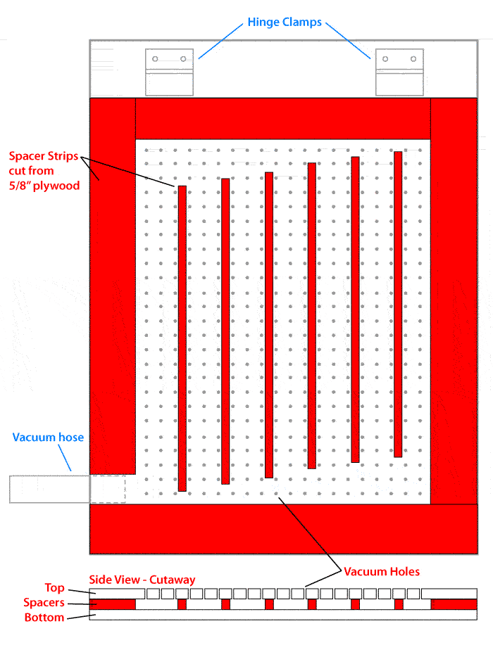
Here are some plans I’ve drawn up. There are no dimensions, but you just make your own press the size you need and adjust the dimensions to fit. You could use these drawings to make your own plans with measurements. It’s a very basic press. You can get very fancy with building a poster press. We didn’t. Ours works. ‘Nuff said.

Plan 1 - The top

Plan 2 - The inside and side view

Assembly Instructions

First you cut all the pieces to size. Most places that will sell you plywood, will cut it for you for free or for a small fee. The inside spacers are the most critical. You want the outer pieces to be at least an inch or so away from the holes you will drill and you want the thinner spacer strips to be 4 or 5 inches shorter than the interior space. See the diagram. Cut the spacer strips to about 3/4” wide by however long you need them, so they will be 5/8” x 3/4” x n.

Next use a t-square to draw a grid with all of the lines spaced 1 inch apart as shown in the first drawing. Drill a hole with a 3/32” bit at each intersection. You might need more than one bit in case it breaks. Once the top is done turn it upside down and glue and screw the spacer boards in place. The spacer boards are indicated in red on the 2nd drawing. Stagger the spacer strips as shown in relation to the vacuum hole. Make sure that the spacer strips are all turned the right way, with the 5/8” sides top and bottom and the 3/4” side to side fitting between the holes you drilled. You can use more spacers inside if you want, but I wouldn’t recommend using fewer. Leave a large enough space on one side to fit your vacuum hose or nozzle. One of those flat attachments works pretty well.

You leave an opening in the side (whichever side works for you) just big enough to insert the vacuum nozzle. We used a flat attachment, shoved it tightly into the space and affixed it with duct tape. I was NOT kidding about the lack of fancy building. But hey, it works.

The vacuum holds the paper in place while you screen print onto it and you just turn it off and on as needed. You can buy a foot switch or a hand switch to make it easier.

Then glue and screw the bottom piece on. Clamp it up with a few clamps and let it dry overnight. Attach the vacuum and try it out. If you have air leaks, plug em. We just squeezed some glue into the leaky spots and let it dry overnight. You can turn the vacuum to blow to check for leaks more easily. Or if yours doesn’t have a reverse, cover the vacuum holes on top and just use a strip of tissue paper to see if it gets sucked to any spots where it shouldn’t.

You mount the hinges in position and you are ready to go.

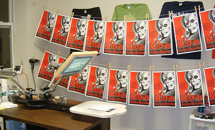
Here’s a photo of our press. The tape and paper on top are set up to print our first poster. Next time I will explain how that all works. Freddy built the press and then the top part where the hinge clamps go separately and mounted them to another piece of plywood. This was both because of the sizes of the wood we had and also so it could be moved easily and frequently. If you read about Our Clandestine Beginnings, you know why.

Here’s a picture of the insides of someone else's project since I didn’t get pictures of Freddy building ours.

Here’s a desktop like the one Freddy used to build the press. Freddy’s best friend and neighbor, Rose, donated this to our cause. Thank you, Rose!

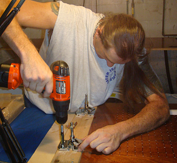
Here’s Freddy installing the new, improved hinge clamps.

A closeup of the Jiffy Clamps and an old, discarded, unsuitable clamp.

To hold up the screen while changing out the paper underneath it we just screw a piece of scrap wood onto the side of the silk screen frame that acts as a leg and pivots. For aluminum frames they make a little gadget called a sidekick. Or you could get creative with it. I’ve seen a press where a guy had a string attached to the bottom of the screen, looped over a frame above and slightly behind the press and attached to a counter weight, a can of coins, that would hold the screen up in place. And he could adjust the weight by adding or removing coins. Heck, you could even just get someone to hold it up for you.

This is the AWT Sidekick

Here's a picture of the press in action.

Next time I will describe the process of printing on paper (flatstock), with and without a vacuum press, and how to print multiple colors.

Our posters are on sale at Deaths Head Designs!

Next: DIY Secrets to Printing Flatstock

Monday, December 20, 2010

The stuff we use, a master list.

More links than you can shake a mouse at.

Our best sources for silk screen supplies. We buy almost everything online.


Dharma Trading.com
DIY Heaven for Textile Artists (with very helpful staff).

Victory Factory
Great source for silk screens and basic supplies.

Silk Screening Supplies.com
Great source for all kinds of silk screen supplies.

Pocono Screen Supply
Another great source for silk screen supplies.


Our best sources for materials to screen print on

Shirts


Jiffyshirts.com
Good prices, volume discounts, no minimum quantity and they sell to anyone.

Blank Apparel
Good prices and no minimum quantity as well.

Alpha Shirt Company
Great for larger quantities and very nice to work with.

Paper

French Paper
Very high quality cards and poster printing stock.

Limited Papers
This place sells in smaller quantities than a printer or paper supplier. They will cut stock to size for a minimal fee. We print our posters on Cougar Opaque White 100# cover stock.


Our best source for outsourcing

Diesel Fuel
The king of screen printing, IMHO (they have done posters and stickers for me).


Inks we use

Union Ink Aerotex Water Based Textile Inks

Non-opaque water based inks that look great and stand the test of time on lighter color fabrics.

Matsui Discharge Inks (Ryonet’s brand is Matsui)
These inks need to be mixed with color pigments to make colors. More about that later.

Discharge Paste Color Remover

So great and easy to use! See my previous blog post.

Enviroline Opaque White Water Based Ink
Prints opaque white on black or dark colors.


Equipment we can recommend


Aluminum frame silk screens
Do yourself a favor and get aluminum instead of wood.

Victory Factory Spray Hose
This has worked for us instead of a pressure washer

Epson WorkForce 1100 Color Inkjet Wide Format Printer
A large format, low price inkjet printer we currently use to print transparency film.

Victory Factory Inkjet film
Works great with the dual cure emulsion we use.

Ulano LX-660 Dual Cure Emulsion
Dual Cure Emulsion, Many are good, but this is what we use.

AWT "Pro Angle" Scoop Coater
MUCH better than Magi-cote, SPS, Atlas, all the ones with plastic ends.

Aluminum UV Screen Exposure Unit
A good basic UV light unit.

4 Color, 2 Station Press
For the very low price, we have been satisfied, though if you can afford a better one, buy a better one. We bought the one without micro registration, but micro registration is a big plus. Ours doesn't have that but it's the lowest cost 4 color press I've seen. We ordered extra brackets and have made several custom platens for it.

The “Flying Wing” Ergonomic Squeegee

A very nice squeegee, though regular wood squeegees are fine too.

Test Print Squares
We go through a lot of these. Better to test on these than ruin a shirt or bag.

Mist
Sticky spray to make the t-shirt stay in place on the platen. Not to be confused with the old computer game I used to be obsessed with.

Ranar Forced Air Flash Dryer DA-1616/110
Took us a while to save up for it, but we are so glad we have this instead of the heat guns we were using. So far it is working great!

Raytec "MiniTemp" Thermometer
Very helpful to know if you have cured a print enough. I check almost every print with it.

Envirostrip Screen Reclaimer/Emulsion Remover
Works better than the toxic stuff.


Education

DVD's


Water Based & Discharge Screen Printing DVD

Specialty Printing DVD (Distressed, Retro, All over, Blends, Artwork & Tags)

A great book to get

Screen Printing Today
or Screen Printing Today
Sold all over the place.


Test Marketing - My test marketing web sites for my designs


Café Press
Zazzle


Sell the stuff you make in an online store.


Etsy.com


Our best web sources of information

Gigposters.com
A site for poster artists and screen printers. Very good information in the forums.

T-Shirtforums.com
A message board where you can ask questions and get help or read lots of info.

Screen Web
A screen printing magazine.

T-Shirt Magazine
A screen printing magazine.

Discharge Inks Ignite Hot Sales (an article)


Our wish list (wistful sigh)
Santa, please take note and remember... you have no proof!

A washout booth
Now that we finally have a place to install one!

Riley Hopkins 4 color 4 station Manual Press
With the aforementioned micro registration.


A thing that sounds pretty good.
I might have tried this if we didn’t have a starter exposure unit. Check it out.

SILKSCREEN POWER: How To Build a Portable Silkscreen Exposure Unit


That's all folks! If I think of anything I missed, I'll add it.

Next: Building Your Own Vacuum Table Poster Press

Saturday, December 18, 2010

Top Tips. Some basic things we have learned.

A random list. (may be added to)

Use aluminum frame silk screens instead of wood. Wood can warp and the mesh gets loose quicker. Another tip, loose mesh is more difficult to print with.

You can have a dual cure emulsion coated silk screen (we use Ulano LX-660) out in fluorescent light or low incandescent room light for a little while, 5 to 10 minutes (or even a bit longer) with no ill effect. Avoid sunlight or UV light, however.

Make your artwork a higher resolution than you think you will need. I have often been glad that I scanned a drawing at 400 or 600, even if I thought I would only need it at 300.

You can make perfectly good custom platens out of sink cut outs from a counter or cabinet shop. They throw them away. Just order the brackets that go with your press and screw them to your home made platens. Reuse, recycle, reduce.

All of the “green” products like the Enviro line that we have tried work better than their toxic counterparts. Especially the reclaimer, Envirostrip.

Buy the best spray bottles you can find for your cleaners. The damn things will leak for no reason. Victory Factory.com sells some.

Write the screen size and mesh count on every screen as soon as you get them with a Sharpie, otherwise you may need this: Mesh Counter. Unless every screen you get is the same. Then ignore this one. We match the screen to the artwork so ours are all different.

Check a new squeegee before you use it to make sure it is straight. Warped squeegee=horror, pain and agony. Believe me on this. More details on the agony later.

A small rip in a non-image area of a screen can be fixed by placing an oval-shaped cut out piece of screen tape or blockout tape on each side of the rip and rubbing it down well.

Sometimes you can “fix” a small blockage on the exposed screen in your design by very gently poking out the hardened emulsion with a very fine needle while looking at it under a high powered magnifying glass like a linen tester. Being careful not to poke too hard and break the threads of the screen. I highly recommend a linen tester for closely examining the screens in any case.

Next: The stuff we use, a master list.

Thursday, December 16, 2010

Dharma’s Discharge Paste Color Remover or Our Chemical Romance

The Holden’s Discharge ink we had used on the Saints of Pain t-shirts (covered in my last installment) was great, we loved it (for the moment, that is) and yet the ink wasn’t exactly like the shirts that had inspired me. The Saints shirts were much, much better than shirts printed with Plastisol ink, which I dislike, but I needed to learn more.

I had also found this stuff, “Discharge Paste” and the description said “Discharge Paste does not always remove all of the color, it depends on the dye and the color to which it is applied.” That intrigued me. Sounded like potential trouble, but intriguing trouble. It doesn’t work like the discharge ink which removes the color from the shirt and replaces it with another color. The discharge paste just removes the color the shirt fabric was dyed with, taking the design back to something like the raw color of the fabric before dyeing. Though it doesn’t work on all dyes or all colors.

Decent quality shirts like Hanes, Anvil, Jerzees, Bella, etc. work the best. Most of the colors will discharge well, but we’ve had trouble with a few colors like Royal Blue, not all the blues, just Royal. Shirts that are the “Pigment Dyed” type don’t seem to discharge very well, though sometimes you can use that as an effect. Another cool effect is to use discharge on a 50/50 cotton/poly blend. Only the cotton fibers discharge, giving the design a kind of distressed or slightly speckled look. At the end I’ve put some pictures of shirts we’ve done with discharge paste.

Using the paste is easy. Here’s what the Dharma web site says “It is fairly safe to use, the main byproduct being ammonia. It is for natural fibers and unlike bleach, it doesn't damage them.” It doesn’t have to be mixed, you use it right out of the container. Doesn’t even need to be thinned with water. It has an odd consistency, sort of gloopy, to use the technical term. Freddy says it’s like snot. It’s water based, so you do need to back flood while you are screening to keep the paste from drying in the screen. Back flooding is when you lightly pull (or push) the squeegee across the screen to lay down a layer of ink that sits on top of the design to both lay ink down on the design for the next print stroke and also to keep a water based ink from drying in the screen.

The gloopy paste:

Here’s a picture of a back flood stroke.

You screen the paste onto a shirt, let it dry and then iron it with a steam iron. An iron that puts out a lot of steam is best. I’ve tried 3 or 4 different irons, but the one we always use is an old iron my dad gave me when I left home. It’s beat up, but still works the best, as long as we clean it regularly. We fill it with water, put it on the cotton setting and iron the design and it appears like magic. It is a bit smelly and it does leave an odor on the shirt until it’s washed. We usually air the shirts out before we deliver them or ship them.

Here's what the shirt looks like when screened. You can barely see the design.

Here is what it looks like as you iron it. Magic!

Here's a closeup of the print. Three years later it still looks great:

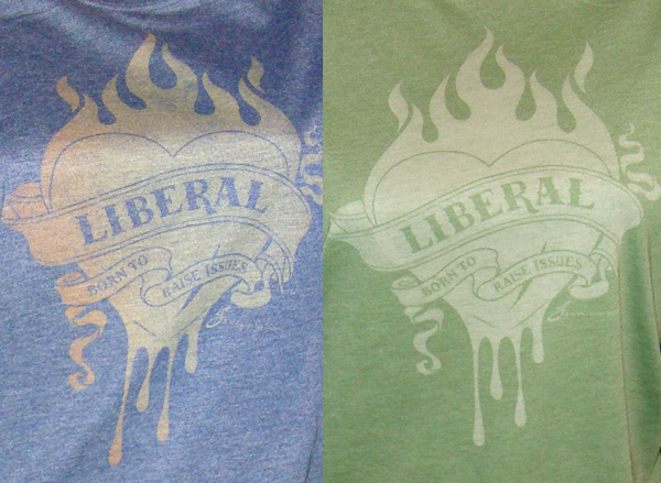
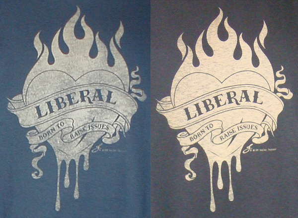
Here are some different shirts we’ve screened with the Discharge Paste. Each one comes out a little different, depending on how you screen it and the color of the shirt. To get the varying degrees of distressing we vary the squeegee pressure slightly. The same screen was used for all of these. We love the unpredictable results and the naturally distressed effect. By far the most popular ones are the more distressed shirts. More examples of what we do can be found on the Deaths Head Designs web site.

Two red 100% cotton shirts, but different brands:

Bella Women's 50/50 Heather Jersey shirts:

A navy blue and a black shirt, both 100% cotton:

A grey Gildan Ultra and an Anvil black spaghetti strap, both 100% cotton:

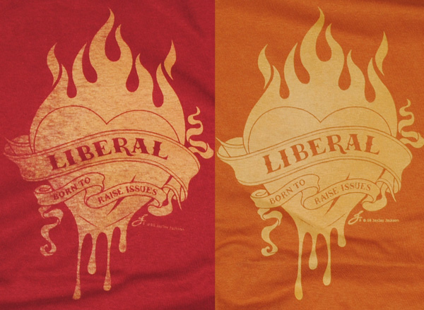
A cardinal red Gildan Ultra and a burnt orange Hanes Beefy T:

Also, here is a very informative video by Catspit Productions that explains different methods of pull or push strokes and flood strokes. This video is demonstrating with Plastisol ink, however, which is a bit different than the water based inks we use.

More of these videos are on Catspit on youtube:

Next: Top Tips