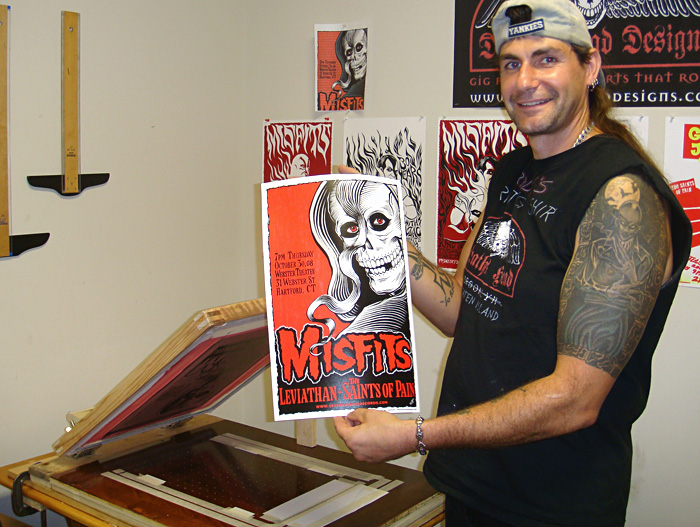
I know I keep mentioning this poster. Our first. Oh, the horror. The first time we tried to screen print a poster it was a whirlwind of trouble. One weekend of pure hell. If this project didn’t make us give up, nothing will. But I will explain all of the problems that we had and maybe that will help if you run into problems.
Before Freddy and I started screen printing, I had designed some posters and had them printed by several different screen printers, all of whom did a wonderful job. But it was time to do our own. We started small. Our first poster was 12” x 18” and 2 colors.
It started out just fine. I took some photos of Freddy posing with a skull I had laying around the house and did the sketch, inked it and did the separations, planning on a simple 2 color poster in classic red and black. Freddy got the poster press built and ready in time for the weekend printing session. We had the screens made for us at Standard Screen in Manhattan since we weren’t experienced at burning screens yet.
The posters I had drawn before were silk screened by other people and I had always done the separations myself. I was very sure to make the posters pretty easy to screen and give the screen printers good separations. But on this one, I got lost in the creative process and created a bit of a difficult registration issue. I did something that is generally not a good idea and had 2 colors need to line up precisely to look right. Below is an example of what I mean. The top picture is the black screen out of register and the bottom picture shows it correctly in register.
The press Freddy built is capable of very accurate registration... when it is working right. Anyway, I had done all of the research on printing posters so we began, thinking we knew what we were doing. We hung the paper up in the basement overnight to let it acclimate so that it wouldn’t change shape on us as it absorbed the humidity or changed temperature.
We started on our adventure. We ran into trouble almost right away. We could not get a good print out of the red screen. Below are some examples of the problems we had.
Here the ink squeezed out under the screen. And perhaps you can see that the texture of the ink is blotchy, not smooth like it should be. The ink we were using was too thick and needed to be thinned, but we did not know. We used the Speedball acrylic ink right out of the jar. Freddy had to press so hard to get it through the screen that it bled under the masked areas. And it was so sticky that it stuck the screen down to the paper and didn’t pop back up like it should even though we increased the off-contact (or space between the screen and the paper). Now we know that it may have been possible that the ink was spreading out under the stencil like that BECAUSE we increased the off-contact. Sigh.
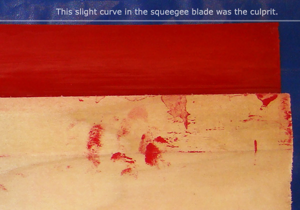
We also had problems with the ink not going on evenly and skipping some areas. Usually the same areas. We would later discover that we had a bad squeegee.
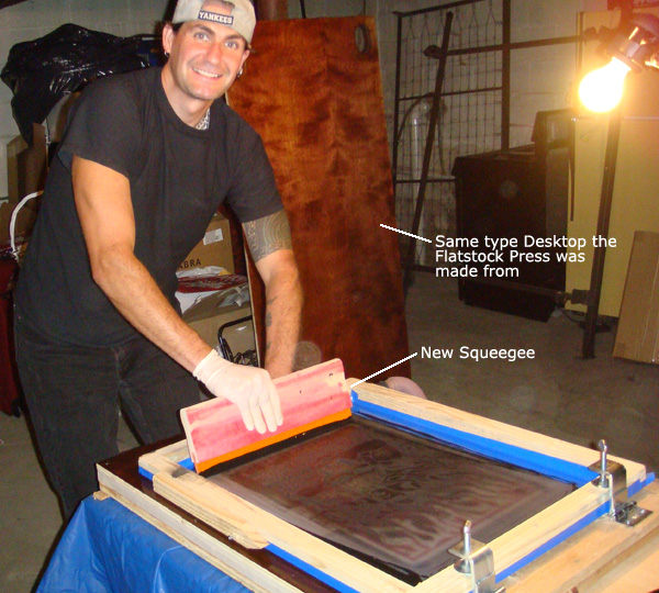
Here’s an action shot at our low point with the bad squeegee, bad ink and bad hinge clamps.
We tried to clean the screen out on the press after it would squeeze out like that, but it didn’t work. We would have to take the screen off and go wash it up and wait for it to dry. During one of these breaks, we re-watched a Speedball DVD we had and realized that perhaps the ink was too thick. So we thinned the ink to the consistency we had seen on the DVD and tried again. It was still hard and we ruined a lot of paper, but we finally got 60 good prints. It seemed like it took forever.
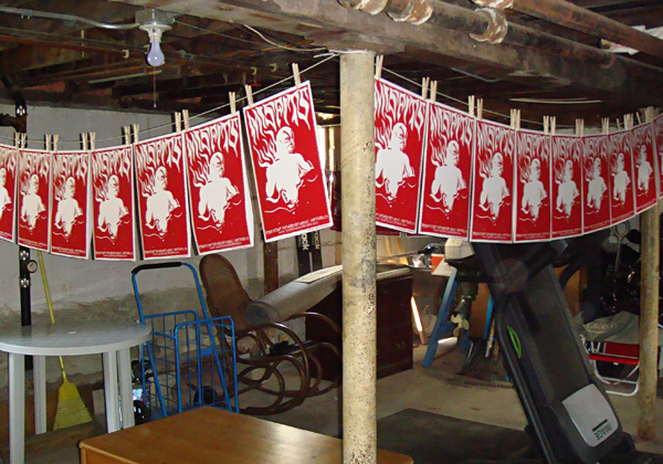
Once the red prints dried, we started trying to print the black screen. It was going worse than ever and now we were ruining some of the red prints we had screened. About that time, while we were cleaning up the screen for another try, Freddy noticed that the squeegee wasn’t straight. It had a slight curve on one end. That was one problem. He also felt like the black ink was too thinned out. So we found another squeegee and I mixed another batch of ink, thicker this time and we started again.
Everything was going wonderfully... until we noticed the black was going out of register. It wasn’t lining up and it was different on every print! We found the problem – the hinge clamps weren’t holding the screen tightly and it was slipping around. No matter how we tightened them with pliers and even vice grips, they would still loosen up.
So we took the Staten Island train to the Staten Island Ferry to (oh god why did I move to Staten island? Oh yeah, a house & basement.) Manhattan and then took the subway to the art supply store to buy the good hinge clamps that we should have bought in the first place. Sigh. But we hadn’t known. Buy Jiffy Clamps. Trust me on this. Here’s a picture. The Jiffy clamps and a discarded old, bad clamp.
We mounted the new Jiffy Clamps and screened the rest of the black. At that point we were amazed at how easy it was. We finished screening the posters and they came out beautifully. We even managed to print my tricky registration with very little trouble at that point.
We finished up and hung the prints to dry. We celebrated our victory by watching a silly horror movie... somehow fitting.
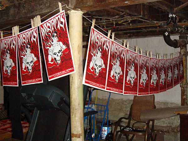
Rawk!
Information and how to's with pictures for anyone interested in doing their own silk screen printing. Based on our adventures in DIY silk screen printing, by Deaths Head Designs.
Showing posts with label JayJay Jackson. Show all posts
Tuesday, January 11, 2011
Thursday, January 6, 2011
DIY Secrets to Printing Flatstock
How We Printed Our Three Color Misfits Poster
Though our first poster for The Misfits
was a weekend carnival of horror and pain that scarred our delicate psyches for eternity, we got some beautiful posters out of it and we learned a lot. The next few posters we tried came out better. We kept learning. So the next Misfits poster was a three color poster for the Halloween weekend show in Hartford, CT. At the show the posters were our biggest hit ever and sold out quickly. Jerry Only, who is always very supportive of our work, even came and signed them all. I will take you through the printing of that poster step by step.
I draw the art for all of our projects by hand and scan it at a high resolution, usually 400 or 600. That’s often higher than I need but it can come in handy for a variety of reasons. I bring the art into Photoshop, touch up the line work (because I’m picky) and do the color separations on separate layers. I print out each layer on a large format inkjet printer (Epson Workforce 1100
) on transparency film and use the film to burn the screens making sure to place the image in the same position on each screen. That makes it possible to line up the screens on the press. We used 200 mesh screens for this project. The equipment and chemicals we use are covered in the master list.
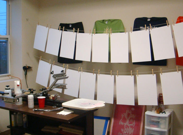
All of these steps could have their own explanation, and I will possibly go into detail about some of that in the future, but things like art, scanning, burning screens, etc. are pretty basic and covered in many other places. I’ve been concentrating on the things we do that are less unusual.
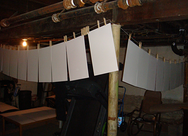
So at the point this tale of edification begins, I have the poster press we built, 3 prepared screens and the paper we will print on. One thing – if you are doing more than one color on your poster, you will need to start the project the night before you will screen print and hang or lay out the approximate amount of paper you will need. Paper can change shape with humidity and temperature so you want it to equalize over night or at least for a few hours so that it doesn’t change shape during your print run and affect the registration of your colors. I generally have about 1/16” overlap of the colors on the separations. That’s usually enough. I will do a more detailed write up on color separations next time.
The paper was hung up overnight:
This Misfits poster was printed in 3 colors of acrylic screen printing ink for paper – red, grey and black. In most cases you would want to print the colors in order with the lightest first to the darkest, last. In the case of this poster we didn’t exactly do that, but close. We printed the red first and then the grey even though the grey is a tiny bit lighter. The colors are semi-opaque and my theory was that the grey would over print the red in some spots and we would have areas of light grey where it overprinted the white paper and darker grey where it overprinted the red. But the ink we used was actually more opaque than I figured so the effect is very subtle. We had gone all over New York City to art supply stores to find just the right red acrylic ink we wanted and then I had to mix the grey from white and black.
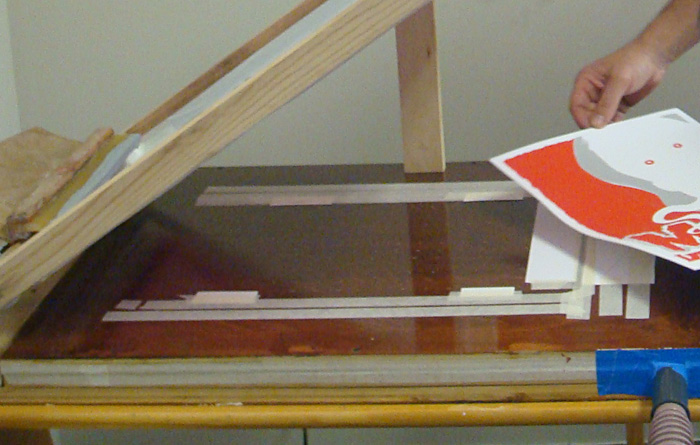
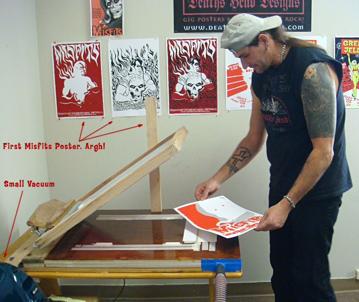
To start with I laid a sheet of the poster paper (Cougar opaque white 100# cover, that we had cut to the finished poster size for us at Limited Papers) in the middle of the vacuum table of the press and turned on the vacuum to hold it in place. I had cut some rectangular pieces of paper out of one of the sheets of poster paper to make guides and I taped these around the sheet of poster paper to mark where I would place the paper each time. I placed the guides right up to the edge of the paper sheet so that every time you placed a sheet of paper on the press it would fit right into the guides and be in the exact same spot. The sheet of paper fits into the guides kind of like putting a piece of a jigsaw puzzle in place. I used guides on three sides of the paper. Not everyone does. Some people use only three guides on two sides. Which is called three point registration. But since our paper gets a bit wavy when we print on it I wanted the extra points of registration.
The guides:
I use the same paper as the posters will be printed on for the guides so that there is no unevenness under the squeegee as it is pulled across the screen. I tape the guides down with a low tack masking tape that doesn’t leave a residue. I use the tape and some more paper to cover all of the holes that won’t be used to hold down the paper sheets we will print on. That way the vacuum won't suck your screen down onto the table, ruining your off contact and is concentrated on the paper sheets we want to hold in place.
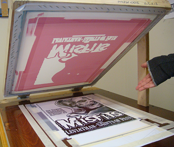
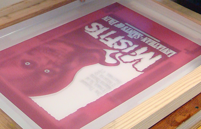
Next I centered the design we will be printing on the paper using the transparency film I burned the screen with. I used the black film in this case since it has all of the line art and I can register all of the other colors to it. If a design is hard to register I will use registration marks, but in this case the colors were easy to register to each other (and I did the art myself and was familiar with it, which helps), so I didn’t bother. I taped down the transparency in position on top of a sheet of blank paper and used that to position the screen. I carefully lined up the screen over the design, pressing down to make sure it was exactly in place over the line art and then tightened the clamps, making sure the screen didn’t pull out of register as we screwed the clamps tight.
Here is the tranparency film taped on the sheet of paper laid into the guides:
Lining up the screen for the first color, red:
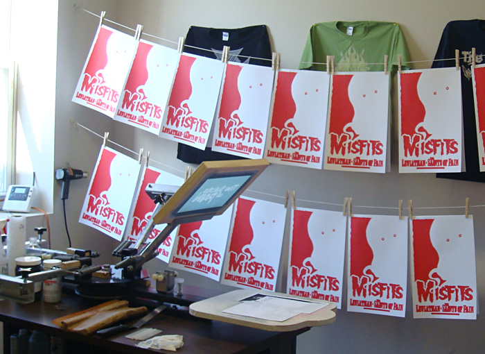
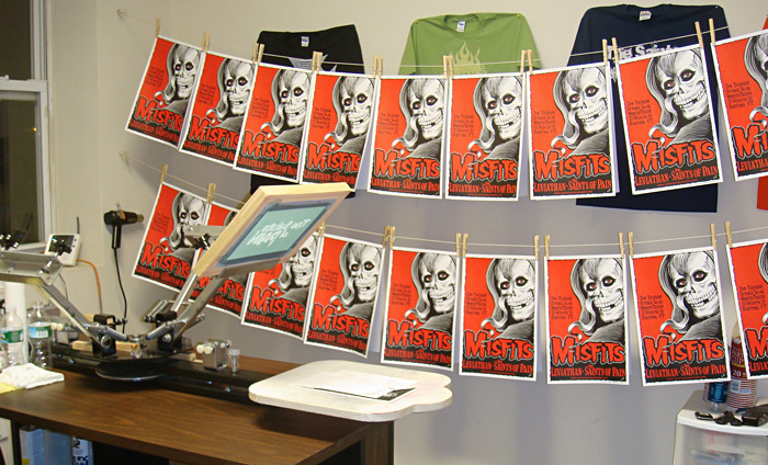
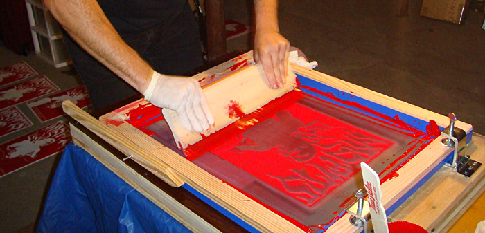
Then we screened the first color, red. We used the ink right out of the jar. We didn’t need to dilute the ink and I didn’t mix it with a retarder to slow the drying time. We haven’t found that necessary with the acrylic poster inks. We hung the posters on string with clothespins, putting 2 back to back to save space. You can also use a rack to dry the posters flat or just lay them around. Whatever works.
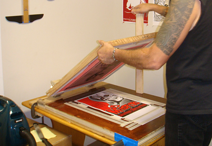
Screening the first color:
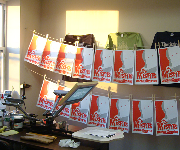
The first run of posters hung up to dry:
We let the posters dry about an hour or so to be safe. Drying times will vary so you just have to feel the ink and see if it’s dry. I mixed up the grey ink for the second printing, lined up the screen for the grey print on the same transparency taped to the same sheet of paper and we printed the second color. And let that dry the same way.
Ready to print the second color:
Printing the second color:
You can see we keep the vacuum in easy reach to switch it off and on:
The second run hung up to dry:
Same process for the last color, black. This time the screen was even easier to line up the screen since I was matching it to to the same art. The paper had gotten somewhat wavy by this time, but not so much that it caused a problem. The vacuum still held it down well enough to keep it from shifting and the print went on fine. Once the prints were dry we stacked them and put them in a case, and they all flattened out.
Printing the final color, black:
The finished poster:
Hung up to dry:
Next: How to Do Color Separations for Screen Printing in Photoshop.
Though our first poster for The Misfits
I draw the art for all of our projects by hand and scan it at a high resolution, usually 400 or 600. That’s often higher than I need but it can come in handy for a variety of reasons. I bring the art into Photoshop, touch up the line work (because I’m picky) and do the color separations on separate layers. I print out each layer on a large format inkjet printer (Epson Workforce 1100
All of these steps could have their own explanation, and I will possibly go into detail about some of that in the future, but things like art, scanning, burning screens, etc. are pretty basic and covered in many other places. I’ve been concentrating on the things we do that are less unusual.
So at the point this tale of edification begins, I have the poster press we built, 3 prepared screens and the paper we will print on. One thing – if you are doing more than one color on your poster, you will need to start the project the night before you will screen print and hang or lay out the approximate amount of paper you will need. Paper can change shape with humidity and temperature so you want it to equalize over night or at least for a few hours so that it doesn’t change shape during your print run and affect the registration of your colors. I generally have about 1/16” overlap of the colors on the separations. That’s usually enough. I will do a more detailed write up on color separations next time.
The paper was hung up overnight:
This Misfits poster was printed in 3 colors of acrylic screen printing ink for paper – red, grey and black. In most cases you would want to print the colors in order with the lightest first to the darkest, last. In the case of this poster we didn’t exactly do that, but close. We printed the red first and then the grey even though the grey is a tiny bit lighter. The colors are semi-opaque and my theory was that the grey would over print the red in some spots and we would have areas of light grey where it overprinted the white paper and darker grey where it overprinted the red. But the ink we used was actually more opaque than I figured so the effect is very subtle. We had gone all over New York City to art supply stores to find just the right red acrylic ink we wanted and then I had to mix the grey from white and black.
To start with I laid a sheet of the poster paper (Cougar opaque white 100# cover, that we had cut to the finished poster size for us at Limited Papers) in the middle of the vacuum table of the press and turned on the vacuum to hold it in place. I had cut some rectangular pieces of paper out of one of the sheets of poster paper to make guides and I taped these around the sheet of poster paper to mark where I would place the paper each time. I placed the guides right up to the edge of the paper sheet so that every time you placed a sheet of paper on the press it would fit right into the guides and be in the exact same spot. The sheet of paper fits into the guides kind of like putting a piece of a jigsaw puzzle in place. I used guides on three sides of the paper. Not everyone does. Some people use only three guides on two sides. Which is called three point registration. But since our paper gets a bit wavy when we print on it I wanted the extra points of registration.
The guides:
I use the same paper as the posters will be printed on for the guides so that there is no unevenness under the squeegee as it is pulled across the screen. I tape the guides down with a low tack masking tape that doesn’t leave a residue. I use the tape and some more paper to cover all of the holes that won’t be used to hold down the paper sheets we will print on. That way the vacuum won't suck your screen down onto the table, ruining your off contact and is concentrated on the paper sheets we want to hold in place.
Next I centered the design we will be printing on the paper using the transparency film I burned the screen with. I used the black film in this case since it has all of the line art and I can register all of the other colors to it. If a design is hard to register I will use registration marks, but in this case the colors were easy to register to each other (and I did the art myself and was familiar with it, which helps), so I didn’t bother. I taped down the transparency in position on top of a sheet of blank paper and used that to position the screen. I carefully lined up the screen over the design, pressing down to make sure it was exactly in place over the line art and then tightened the clamps, making sure the screen didn’t pull out of register as we screwed the clamps tight.
Here is the tranparency film taped on the sheet of paper laid into the guides:
Lining up the screen for the first color, red:
Then we screened the first color, red. We used the ink right out of the jar. We didn’t need to dilute the ink and I didn’t mix it with a retarder to slow the drying time. We haven’t found that necessary with the acrylic poster inks. We hung the posters on string with clothespins, putting 2 back to back to save space. You can also use a rack to dry the posters flat or just lay them around. Whatever works.
Screening the first color:
The first run of posters hung up to dry:
We let the posters dry about an hour or so to be safe. Drying times will vary so you just have to feel the ink and see if it’s dry. I mixed up the grey ink for the second printing, lined up the screen for the grey print on the same transparency taped to the same sheet of paper and we printed the second color. And let that dry the same way.
Ready to print the second color:
Printing the second color:
You can see we keep the vacuum in easy reach to switch it off and on:
The second run hung up to dry:
Same process for the last color, black. This time the screen was even easier to line up the screen since I was matching it to to the same art. The paper had gotten somewhat wavy by this time, but not so much that it caused a problem. The vacuum still held it down well enough to keep it from shifting and the print went on fine. Once the prints were dry we stacked them and put them in a case, and they all flattened out.
Printing the final color, black:
The finished poster:
Hung up to dry:
Next: How to Do Color Separations for Screen Printing in Photoshop.
Subscribe to:
Posts (Atom)