Showing posts with label textile art. Show all posts

Thursday, January 27, 2011

10 Things Never to do While Screen Printing Water-based inks and Discharge inks


Don’t stop, slow down or take a phone call or Twitter break. Keep printing. If the ink dries in the screen it’s trouble. If you do have to stop you can try wrapping the screen with plastic wrap. We've tried that with mixed results. And by mixed, I mean not really successful, but others have reported better results.

Don’t put too much ink on the screen. It will start to dry up and become gloppy, to use the technical term. If you put too much ink on the screen at once it may become thick and uneven and be hard to get through the screen mesh.

Don’t put too little ink on the screen. Be sure there’s enough for a good back flood stroke to protect the ink from drying in the image you’re printing.
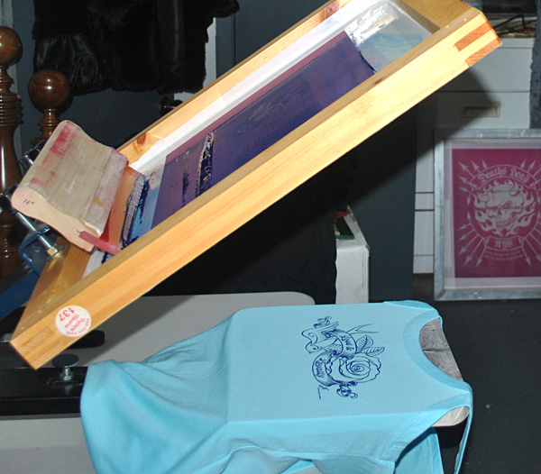

Don’t leave your ink container open. Keep it covered as much as you can so the ink doesn’t get gloppy or dry up on the edges.

Don’t print too many different colors unless you are pretty experienced at it. The more colors you are printing, the more time the ink has to dry up in the screens. But it depends on the ink. Some inks dry more slowly. We do 3 colors pretty well with Aerotex inks. 4 not as well. We’re getting better.

Don’t zone out. Go carefully, keep checking your work and making sure no problems are cropping up and you can avoid expensive mistakes. In screen printing, mistakes generally cost.

Don’t guess at curing temperatures. Buy an infrared thermometer gun. We try for around 325 or 350 degrees for discharge inks and also for water based.

Don’t rely on your memory. Make notes. Write down exposure times, inks used, mesh counts, what worked right, ideas, inventory, everything.

Don’t wait to wash out your screen after you finished printing. Get some water onto that thing right away. And if you start having drying problems during a run, mist the screen (on the ink side) with a light mist of water.

Don’t think you can get away without test printing. Always test print if you are doing something for the first time, or haven’t tried something in a while.


But, DO have a good time making cool stuff and especially enjoy wearing your beautiful and very comfortable eco-friendly creations!

Model Tony Robinson, actor and artist, enjoying the shirt we made especially for him. Check out his work here.
The Liberal, Born to Raise Issues shirt is available here.

Next: Birth of an Award-Winning Poster

Thursday, December 16, 2010

Dharma’s Discharge Paste Color Remover or Our Chemical Romance

The Holden’s Discharge ink we had used on the Saints of Pain t-shirts (covered in my last installment) was great, we loved it (for the moment, that is) and yet the ink wasn’t exactly like the shirts that had inspired me. The Saints shirts were much, much better than shirts printed with Plastisol ink, which I dislike, but I needed to learn more.

I had also found this stuff, “Discharge Paste” and the description said “Discharge Paste does not always remove all of the color, it depends on the dye and the color to which it is applied.” That intrigued me. Sounded like potential trouble, but intriguing trouble. It doesn’t work like the discharge ink which removes the color from the shirt and replaces it with another color. The discharge paste just removes the color the shirt fabric was dyed with, taking the design back to something like the raw color of the fabric before dyeing. Though it doesn’t work on all dyes or all colors.

Decent quality shirts like Hanes, Anvil, Jerzees, Bella, etc. work the best. Most of the colors will discharge well, but we’ve had trouble with a few colors like Royal Blue, not all the blues, just Royal. Shirts that are the “Pigment Dyed” type don’t seem to discharge very well, though sometimes you can use that as an effect. Another cool effect is to use discharge on a 50/50 cotton/poly blend. Only the cotton fibers discharge, giving the design a kind of distressed or slightly speckled look. At the end I’ve put some pictures of shirts we’ve done with discharge paste.

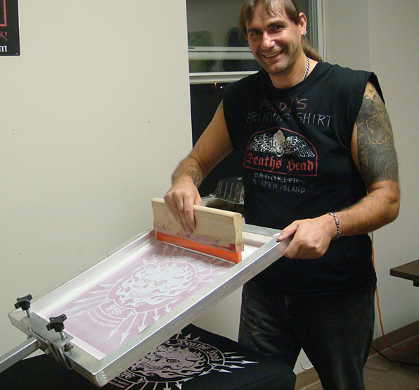
Using the paste is easy. Here’s what the Dharma web site says “It is fairly safe to use, the main byproduct being ammonia. It is for natural fibers and unlike bleach, it doesn't damage them.” It doesn’t have to be mixed, you use it right out of the container. Doesn’t even need to be thinned with water. It has an odd consistency, sort of gloopy, to use the technical term. Freddy says it’s like snot. It’s water based, so you do need to back flood while you are screening to keep the paste from drying in the screen. Back flooding is when you lightly pull (or push) the squeegee across the screen to lay down a layer of ink that sits on top of the design to both lay ink down on the design for the next print stroke and also to keep a water based ink from drying in the screen.

The gloopy paste:

Here’s a picture of a back flood stroke.

You screen the paste onto a shirt, let it dry and then iron it with a steam iron. An iron that puts out a lot of steam is best. I’ve tried 3 or 4 different irons, but the one we always use is an old iron my dad gave me when I left home. It’s beat up, but still works the best, as long as we clean it regularly. We fill it with water, put it on the cotton setting and iron the design and it appears like magic. It is a bit smelly and it does leave an odor on the shirt until it’s washed. We usually air the shirts out before we deliver them or ship them.

Here's what the shirt looks like when screened. You can barely see the design.

Here is what it looks like as you iron it. Magic!

Here's a closeup of the print. Three years later it still looks great:

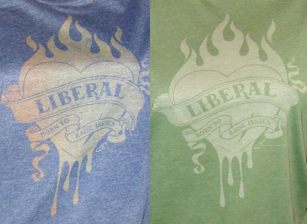
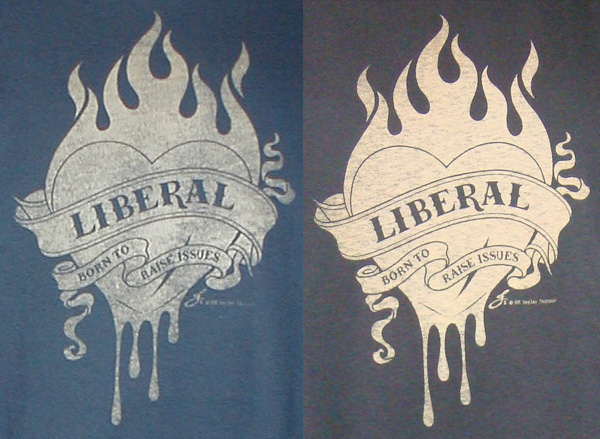
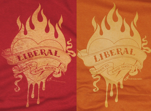
Here are some different shirts we’ve screened with the Discharge Paste. Each one comes out a little different, depending on how you screen it and the color of the shirt. To get the varying degrees of distressing we vary the squeegee pressure slightly. The same screen was used for all of these. We love the unpredictable results and the naturally distressed effect. By far the most popular ones are the more distressed shirts. More examples of what we do can be found on the Deaths Head Designs web site.

Two red 100% cotton shirts, but different brands:

Bella Women's 50/50 Heather Jersey shirts:

A navy blue and a black shirt, both 100% cotton:

A grey Gildan Ultra and an Anvil black spaghetti strap, both 100% cotton:

A cardinal red Gildan Ultra and a burnt orange Hanes Beefy T:

Also, here is a very informative video by Catspit Productions that explains different methods of pull or push strokes and flood strokes. This video is demonstrating with Plastisol ink, however, which is a bit different than the water based inks we use.

More of these videos are on Catspit on youtube:

Next: Top Tips