And How to Fix Them
1. Art problems -
A. Start with good artwork, properly prepared. Don’t use a low resolution jpeg and think you will get a good screen print out of it. The art should be a minimum of 300 ppi at print size.
B. Make sure you can print the design correctly and match it with the correct screen mesh for the artwork.
C. If you have a customer, make sure they sign an approval of the final design. You’d hate to reprint a design at your own expense because a word was misspelled!
Here's a nice design made to look distressed. (a new design we are testing) Because of the small details we burned this art on 156 mesh screens to print on t-shirts.
2. Screen Exposure problems -
A detailed list of screen problems here: Troubleshooting Screen Problems
3. Bad registration -
A. Screens can become loose in the bracket on the press if not tightened enough.
B. The platen might be moving if the screw is not tightened enough. Turn it as tight as you can being careful not to strip it.
C. The shirt might be moving if you don’t have enough adhesive on the platen.
4. Screen break down -
A. If the screen was under exposed, the emulsion can loosen and come off. We always “post-expose” the screen. Which means we either place it in the sun after it’s been washed out and dried or we expose it again in the exposure unit to set the emulsion.
B. The squeegee can wear through the emulsion on a long print run or on a screen that has been used a lot. If the worn spots are outside of the design area you can clean the screen, spread a thin coat of emulsion over the worn areas and expose it to repair the bare spots.
5. Bad ink curing, ink under cured or over cured -
A. Check the curing temperature with a temperature gun. And know what temperature the ink is supposed to cure at, of course. I usually print out a sheet of instructions that go with the ink and stick it to the lid of the ink container.
My instructions unfolded. They are stuck to the lid with double-sided tape.
6. Incorrect squeegee angle -
A. Try for a consistent 45 degree angle when applying ink to the screen. Ink goes on pretty smooth at this angle. At an angle of 60-degrees or more, the ink may not get through the mesh correctly and evenly. An angle of 30-degrees or less can make the ink print too heavily onto the fabric.
B. You may need to experiment with the squeegee angle and practice to get it right, see what works for you and keep it consistent. You can also experiment with a “push” print stroke as opposed to the usual “pull” print stroke. There are cases when a push stroke can be useful. But always do one or the other, don’t switch between strokes.
Freddy usually screens a bit closer to a 60 degree angle, but that's what seems to work for him.
7. Ink spots or smudges on garment or product -
A. Keep the work area and your hands clean.
B. Check the screen carefully for pinholes and fill them with a screen touch-up pen or cover them with a piece of tape.
C. Wash out small spots with a wet shop towel or a spot cleaning gun. If you can’t clean it, keep the shirt and use it for test prints.
8. Design placed incorrectly -
A. Line up you screen carefully. We usually use a t-square to make sure the design is straight.
B. Not all shirts or other garments are sewn correctly or consistently. So you may not be able to use the collar or center crease to position a shirt. The most reliable way I’ve found to center a shirt is this: How to Center a Shirt for Silk Screening
9. Too much ink is getting printed onto the shirt -
A. You may be using too much pressure. Don’t press down too hard on the squeegee and use even pressure all the way across the print.
B. You may have gotten too much ink into the mesh on the back flood. Be careful as you back flood and don’t press down too hard or go over it too many times. If your ink does get too heavy, pull a few prints on test sheets without back flooding to clear out the screen.
C. The ink may be too thinned out
D. You may have an old squeegee with edges that are rounded and need to be sharpened.
10. Too little ink is getting printed onto the shirt -
A. Use a coarser mesh.
B. Make more than one squeegee pass to print. We sometimes do as many as 3, but that is usually the most we need.
C. The screen may be getting clogged. We will rub the underside of the screen with a wet shop towel and then screen a test print or two to try to clear it out. We print on test print squares or misprinted t-shirts and use blank newsprint when test printing for posters and art prints. (Note: We have been told that spraying water mixed with a little bit of dish soap on the underside of the screen before you put any ink on it helps when you print. We mean to try this next time we print.)
D. Try printing on a soft base. We sometimes use a platen covered in neoprene fabric. Especially when we want to print over collars or seams (more on this topic later).
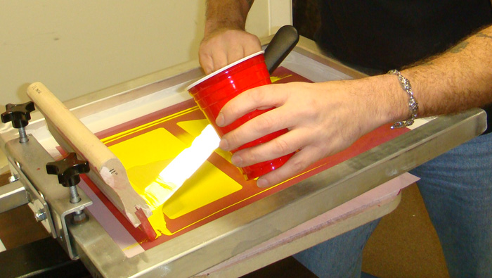
Here's Freddy adding more ink to a screen. You can see that there wasn't enough ink to back flood properly and it's spotty behind the cake spreader he uses for the ink.
Mistakes will happen, but my best general advice is to work carefully to head off problems before they happen.
Next: How to prepare a screen for printing.
Information and how to's with pictures for anyone interested in doing their own silk screen printing. Based on our adventures in DIY silk screen printing, by Deaths Head Designs.
Showing posts with label art. Show all posts
Monday, February 21, 2011
Saturday, January 29, 2011
Birth of an Award-Winning Poster
A bit of my creative process.
Got the job one day to do a new poster for Leviathan, the number one band I did posters for. They were opening for Six Feet Under, death metal band extraordinaire. I had been doing some sexy pin up girls on the posters for that band, so I thought I would do another one. The name of the band, Six Feet Under, does suggest a death-oriented theme so a sexy, deadly pin up girl was one idea I had. I love horror movies and every once in a while the girl ISN’T the victim. lol. So I settled on the idea for a girl with a bloody axe who may have just gotten some guy ready to be put six feet under. It turned out to be one of my most successful posters.
I had pitched the idea to the band and gotten a go ahead on it. I played around with some loose sketches and looked at my girl photo reference files to see if I could find a good pose. I like to collect old photos from the 40’s and 50’s. Mostly I like the coy, flirtatious body language and the weight of the women more than the modern look. I find that the women in most modern photos are too thin to look sexy to me, I'm repulsed by breast augmentation surgery and the body language is totally different. A sort of forced, self conscious sexuality that lacks that sense of fun many of the older pin ups have. I also like the quality of the light in the older photos. So I found a photo that had a nice pose and attitude to base my drawing on. I generally don’t stick too close to the photo reference, but use it as a guide to help me make the pose and proportion believable.
I got my boyfriend to take photos of my own hands holding a hammer behind my back to help get the hands right. Hands are difficult for me so I really have to work at them. But I can’t show that photo because I’m not uploading a photo of MY bare butt. lol. The drawing worked out pretty well and I inked it. I actually did the blood on the ground separately on another sheet of paper because I didn’t plan ahead and ran out of space on the first sheet. Since getting used to working with the computer, I sometimes work kind of rushed and sloppy and just fix things later. I figure the end product is what matters. I don’t like to sell my original artwork so I don’t go into a job with the idea of producing the art for a secondary sales market. Many people do, and that’s just fine. I guess I just can't wait to see the final result so I'm always in a rush to get to that point. Besides, technique isn't what matters on posters like this as much as it would on a painting. So, I scanned everything and put it all together in Photoshop and cleaned up the line work.
I knew I wanted two of the colors to be black and red, but it took a little experimentation to decide on the aqua blue. Once I tried that I liked it immediately. The icy coolness seemed good for a beautiful axe murderer. And the aqua has a nice vibration against the red, since it's close to the compliment on the color wheel.
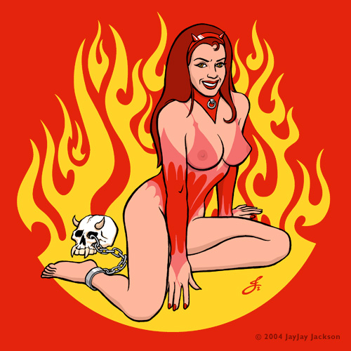
One thing I try to infuse into all of the pin up girls I draw is a sense of the woman being in control, and having fun. My girls are not victims, even when they are chained. They are avid participants in, what I hope is, sex-positive imagery. I find the popular fad for sad, sexualized child-women in gothic and outsider art very unpleasant and I consciously avoid any hint of that in my own work.
Once the poster was done and I got final approval from the band I arranged to have it screen printed. Luckily the band was willing to come up with the money to have Diesel Fuel do the job. They are very good. I did the separations and supplied some pantone colors for them to shoot for when mixing the inks and sent the artwork off over the internet. No more Fed Exing or mailing artwork... I love it. Things are so much easier now. An artist who remembers how things used to be can’t help but marvel at it.
I am a member of the gigposters.com web site for poster artists and fans and I upload all of my posters to the site. And the Six Feet Under poster won the Poster of the Week award! Which is very exciting. It also helped with sales and got loads of attention which led to doing more posters. So that was very nice! If you are interested in owning one of the Six Feet Under posters, we still have a few left, here on the Deaths Head Designs page.
Next: Finally, a good opaque water-based white ink!
Got the job one day to do a new poster for Leviathan, the number one band I did posters for. They were opening for Six Feet Under, death metal band extraordinaire. I had been doing some sexy pin up girls on the posters for that band, so I thought I would do another one. The name of the band, Six Feet Under, does suggest a death-oriented theme so a sexy, deadly pin up girl was one idea I had. I love horror movies and every once in a while the girl ISN’T the victim. lol. So I settled on the idea for a girl with a bloody axe who may have just gotten some guy ready to be put six feet under. It turned out to be one of my most successful posters.
I had pitched the idea to the band and gotten a go ahead on it. I played around with some loose sketches and looked at my girl photo reference files to see if I could find a good pose. I like to collect old photos from the 40’s and 50’s. Mostly I like the coy, flirtatious body language and the weight of the women more than the modern look. I find that the women in most modern photos are too thin to look sexy to me, I'm repulsed by breast augmentation surgery and the body language is totally different. A sort of forced, self conscious sexuality that lacks that sense of fun many of the older pin ups have. I also like the quality of the light in the older photos. So I found a photo that had a nice pose and attitude to base my drawing on. I generally don’t stick too close to the photo reference, but use it as a guide to help me make the pose and proportion believable.
I got my boyfriend to take photos of my own hands holding a hammer behind my back to help get the hands right. Hands are difficult for me so I really have to work at them. But I can’t show that photo because I’m not uploading a photo of MY bare butt. lol. The drawing worked out pretty well and I inked it. I actually did the blood on the ground separately on another sheet of paper because I didn’t plan ahead and ran out of space on the first sheet. Since getting used to working with the computer, I sometimes work kind of rushed and sloppy and just fix things later. I figure the end product is what matters. I don’t like to sell my original artwork so I don’t go into a job with the idea of producing the art for a secondary sales market. Many people do, and that’s just fine. I guess I just can't wait to see the final result so I'm always in a rush to get to that point. Besides, technique isn't what matters on posters like this as much as it would on a painting. So, I scanned everything and put it all together in Photoshop and cleaned up the line work.
I knew I wanted two of the colors to be black and red, but it took a little experimentation to decide on the aqua blue. Once I tried that I liked it immediately. The icy coolness seemed good for a beautiful axe murderer. And the aqua has a nice vibration against the red, since it's close to the compliment on the color wheel.
One thing I try to infuse into all of the pin up girls I draw is a sense of the woman being in control, and having fun. My girls are not victims, even when they are chained. They are avid participants in, what I hope is, sex-positive imagery. I find the popular fad for sad, sexualized child-women in gothic and outsider art very unpleasant and I consciously avoid any hint of that in my own work.
Once the poster was done and I got final approval from the band I arranged to have it screen printed. Luckily the band was willing to come up with the money to have Diesel Fuel do the job. They are very good. I did the separations and supplied some pantone colors for them to shoot for when mixing the inks and sent the artwork off over the internet. No more Fed Exing or mailing artwork... I love it. Things are so much easier now. An artist who remembers how things used to be can’t help but marvel at it.
I am a member of the gigposters.com web site for poster artists and fans and I upload all of my posters to the site. And the Six Feet Under poster won the Poster of the Week award! Which is very exciting. It also helped with sales and got loads of attention which led to doing more posters. So that was very nice! If you are interested in owning one of the Six Feet Under posters, we still have a few left, here on the Deaths Head Designs page.
Next: Finally, a good opaque water-based white ink!
Labels:
art,
band,
concept,
concert,
drawing,
gigposters,
girl,
leviathan,
pin up,
poster,
process,
screen printing,
sexy,
silk screen,
six feet under
Saturday, December 18, 2010
Top Tips. Some basic things we have learned.
A random list. (may be added to)
Use aluminum frame silk screens instead of wood. Wood can warp and the mesh gets loose quicker. Another tip, loose mesh is more difficult to print with.
You can have a dual cure emulsion coated silk screen (we use Ulano LX-660) out in fluorescent light or low incandescent room light for a little while, 5 to 10 minutes (or even a bit longer) with no ill effect. Avoid sunlight or UV light, however.
Make your artwork a higher resolution than you think you will need. I have often been glad that I scanned a drawing at 400 or 600, even if I thought I would only need it at 300.
You can make perfectly good custom platens out of sink cut outs from a counter or cabinet shop. They throw them away. Just order the brackets that go with your press and screw them to your home made platens. Reuse, recycle, reduce.
All of the “green” products like the Enviro line that we have tried work better than their toxic counterparts. Especially the reclaimer, Envirostrip.
Buy the best spray bottles you can find for your cleaners. The damn things will leak for no reason. Victory Factory.com sells some.
Write the screen size and mesh count on every screen as soon as you get them with a Sharpie, otherwise you may need this: Mesh Counter. Unless every screen you get is the same. Then ignore this one. We match the screen to the artwork so ours are all different.
Check a new squeegee before you use it to make sure it is straight. Warped squeegee=horror, pain and agony. Believe me on this. More details on the agony later.
A small rip in a non-image area of a screen can be fixed by placing an oval-shaped cut out piece of screen tape or blockout tape on each side of the rip and rubbing it down well.

Sometimes you can “fix” a small blockage on the exposed screen in your design by very gently poking out the hardened emulsion with a very fine needle while looking at it under a high powered magnifying glass like a linen tester. Being careful not to poke too hard and break the threads of the screen. I highly recommend a linen tester for closely examining the screens in any case.
Next: The stuff we use, a master list.
Use aluminum frame silk screens instead of wood. Wood can warp and the mesh gets loose quicker. Another tip, loose mesh is more difficult to print with.
You can have a dual cure emulsion coated silk screen (we use Ulano LX-660) out in fluorescent light or low incandescent room light for a little while, 5 to 10 minutes (or even a bit longer) with no ill effect. Avoid sunlight or UV light, however.
Make your artwork a higher resolution than you think you will need. I have often been glad that I scanned a drawing at 400 or 600, even if I thought I would only need it at 300.
You can make perfectly good custom platens out of sink cut outs from a counter or cabinet shop. They throw them away. Just order the brackets that go with your press and screw them to your home made platens. Reuse, recycle, reduce.
All of the “green” products like the Enviro line that we have tried work better than their toxic counterparts. Especially the reclaimer, Envirostrip.
Buy the best spray bottles you can find for your cleaners. The damn things will leak for no reason. Victory Factory.com sells some.
Write the screen size and mesh count on every screen as soon as you get them with a Sharpie, otherwise you may need this: Mesh Counter. Unless every screen you get is the same. Then ignore this one. We match the screen to the artwork so ours are all different.
Check a new squeegee before you use it to make sure it is straight. Warped squeegee=horror, pain and agony. Believe me on this. More details on the agony later.
A small rip in a non-image area of a screen can be fixed by placing an oval-shaped cut out piece of screen tape or blockout tape on each side of the rip and rubbing it down well.
Sometimes you can “fix” a small blockage on the exposed screen in your design by very gently poking out the hardened emulsion with a very fine needle while looking at it under a high powered magnifying glass like a linen tester. Being careful not to poke too hard and break the threads of the screen. I highly recommend a linen tester for closely examining the screens in any case.
Next: The stuff we use, a master list.
Labels:
art,
best of,
diy,
do it yourself,
hints,
list,
screen printing,
silk screen,
tips
Subscribe to:
Posts (Atom)