Showing posts with label handmade. Show all posts

Saturday, January 8, 2011

How to Do Color Separations for Screen Printing in Photoshop

Also Scanning Line Art
Note: The information here is for people with some familiarity with screen printing and computer graphics, specifically Adobe Photoshop.

Here are a few examples of how I do color separations for silk screened posters in Photoshop. Of course, you can do color separations by hand and cut the film, but I did that for way too many years before we had computers. So screw that. I’ll give up my Adobe Photoshop when they pry it from my cold, dead fingers. Still have a bunch of Rubylith in a box somewhere. You can have it.

To start with I draw my art by hand. In case you are wondering, I sketch the drawing and transfer my sketch to Graphics 360 Marker paper with a mechanical pencil, tightening the sketch as I transfer it, and then ink it with markers, mostly Pigma Micron. Both the regular markers and the brush markers. I don’t use white out. If I make a mistake, I usually draw the correction right through the mistake and fix the line art in Photoshop. I'm not trying to produce an original masterpiece, just a good final product and fast is better.

Once the art is finished and the pencil lines erased, I scan it at a pretty high resolution in Black & White Grayscale mode. The resolution depends on what size I drew the art. I have a pretty tight drawing style so I sometimes draw the art smaller than the finished print size and scan it at 600 pixels/inch. If the art is closer to the final size I might use 400 pixels/inch.

I scan it in Grayscale, import it into Photoshop and use Image > Adjustments > Threshold to change the image to a bitmap and eliminate the anti-aliasing that makes the lines fuzzy, playing with the setting to get the line weight I want. If the line art is too light I will use the Brightness/Contrast adjustment to darken the lines before I use the Threshold adjustment. Once the art is totally black and white with no grays I touch up the art with the pencil tool to keep the hard edge on the art. Keeping the edge non-anti aliased makes selecting the lines easy and doing the separations easy and accurate. I do the separations in either RGB or CMYK mode. If you are printing the seps out on an inkjet printer like we do, it doesn't matter much.

Here’s a scan of some line art before it was touched up. Scanned at 600 pixels/inch. You can see some of the mistakes I made in the inking.

Here’s a closeup of the line art after it’s been touched up. The final resolution ended up being 372 ppi at print size, 18” x 22”.

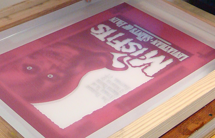
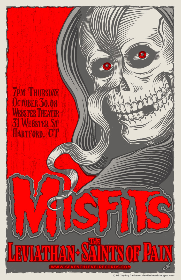
Here’s the final color art that was separated for screen printing.

Here’s an animation of the 4 color separations.

For the Misfits poster described in my last blog post, I drew the line art and later decided how to color separate the colors. I had a pretty good idea of how to color it, but it wasn’t totally planned. Here are some possibilities I tried out. The last one is the one I decided on:

That last combination of colors made parts of the separations slightly complicated. Here’s the line art I started with.

Here are the separations for that poster with the black line art grayed out a bit so you can see the overlap of the other colors, the red and the gray.

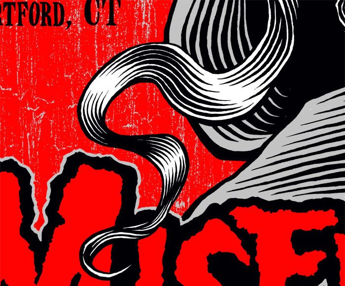
Here are some detail shots of part of the poster. This is all three colors with the black lines grayed out some.

This is just the gray and the red without the black lines.

This is just the black and the red with the black lines grayed out.

This is all three colors as it would print.

Sometimes doing color separations is easy. Below is a detail of a poster I did for a Viking Kings show. I drew the black line art and mostly just had to fill in the colors.

Here’s the same detail with the black lines grayed out.

To do the seps for this Viking Kings poster, I just selected the open areas with the Magic Wand Tool in Photoshop, with anti aliasing turned off (unchecked). Once I had the areas selected I went to the Select menu and used the Modify > Expand to make the selection larger and then filled the area with color on a new layer (Edit > Fill). I do the color separations in color at first and then fill them with black to print the layers on transparencies, since you need good solid black art to burn the screen. You can see on the detail above that there were a few areas that I had to draw the color in by hand, using the pencil tool, but most of it I was able to just Expand and Fill.

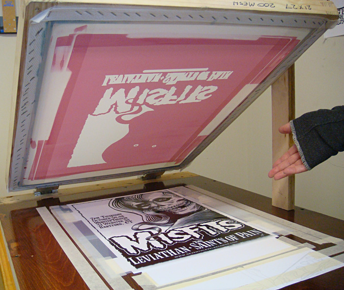
On the Misfits poster, there’s a good bit of outlining done by hand, but I take any shortcut I can whenever I can. I knew I would print the colors in the order red - gray - black and I did the separations for that order. Hopefully all of that is clear. If you get the concept, then the best way to explain it is to just show you what I did, hence all of the big pictures. The information is not for beginners, but if you would like more information or explanation, you can email me and I will try to answer your questions.

There are many other ways to do separations and I would urge anyone reading this to seek out more information and choose the way the suits you best. The best way to figure out the best way is to know all the ways.

Next: The World’s Most Painful Poster

Thursday, January 6, 2011

DIY Secrets to Printing Flatstock

How We Printed Our Three Color Misfits Poster

Though our first poster for The Misfits was a weekend carnival of horror and pain that scarred our delicate psyches for eternity, we got some beautiful posters out of it and we learned a lot. The next few posters we tried came out better. We kept learning. So the next Misfits poster was a three color poster for the Halloween weekend show in Hartford, CT. At the show the posters were our biggest hit ever and sold out quickly. Jerry Only, who is always very supportive of our work, even came and signed them all. I will take you through the printing of that poster step by step.

I draw the art for all of our projects by hand and scan it at a high resolution, usually 400 or 600. That’s often higher than I need but it can come in handy for a variety of reasons. I bring the art into Photoshop, touch up the line work (because I’m picky) and do the color separations on separate layers. I print out each layer on a large format inkjet printer (Epson Workforce 1100) on transparency film and use the film to burn the screens making sure to place the image in the same position on each screen. That makes it possible to line up the screens on the press. We used 200 mesh screens for this project. The equipment and chemicals we use are covered in the master list.

All of these steps could have their own explanation, and I will possibly go into detail about some of that in the future, but things like art, scanning, burning screens, etc. are pretty basic and covered in many other places. I’ve been concentrating on the things we do that are less unusual.

So at the point this tale of edification begins, I have the poster press we built, 3 prepared screens and the paper we will print on. One thing – if you are doing more than one color on your poster, you will need to start the project the night before you will screen print and hang or lay out the approximate amount of paper you will need. Paper can change shape with humidity and temperature so you want it to equalize over night or at least for a few hours so that it doesn’t change shape during your print run and affect the registration of your colors. I generally have about 1/16” overlap of the colors on the separations. That’s usually enough. I will do a more detailed write up on color separations next time.
The paper was hung up overnight:

This Misfits poster was printed in 3 colors of acrylic screen printing ink for paper – red, grey and black. In most cases you would want to print the colors in order with the lightest first to the darkest, last. In the case of this poster we didn’t exactly do that, but close. We printed the red first and then the grey even though the grey is a tiny bit lighter. The colors are semi-opaque and my theory was that the grey would over print the red in some spots and we would have areas of light grey where it overprinted the white paper and darker grey where it overprinted the red. But the ink we used was actually more opaque than I figured so the effect is very subtle. We had gone all over New York City to art supply stores to find just the right red acrylic ink we wanted and then I had to mix the grey from white and black.

To start with I laid a sheet of the poster paper (Cougar opaque white 100# cover, that we had cut to the finished poster size for us at Limited Papers) in the middle of the vacuum table of the press and turned on the vacuum to hold it in place. I had cut some rectangular pieces of paper out of one of the sheets of poster paper to make guides and I taped these around the sheet of poster paper to mark where I would place the paper each time. I placed the guides right up to the edge of the paper sheet so that every time you placed a sheet of paper on the press it would fit right into the guides and be in the exact same spot. The sheet of paper fits into the guides kind of like putting a piece of a jigsaw puzzle in place. I used guides on three sides of the paper. Not everyone does. Some people use only three guides on two sides. Which is called three point registration. But since our paper gets a bit wavy when we print on it I wanted the extra points of registration.
The guides:

I use the same paper as the posters will be printed on for the guides so that there is no unevenness under the squeegee as it is pulled across the screen. I tape the guides down with a low tack masking tape that doesn’t leave a residue. I use the tape and some more paper to cover all of the holes that won’t be used to hold down the paper sheets we will print on. That way the vacuum won't suck your screen down onto the table, ruining your off contact and is concentrated on the paper sheets we want to hold in place.

Next I centered the design we will be printing on the paper using the transparency film I burned the screen with. I used the black film in this case since it has all of the line art and I can register all of the other colors to it. If a design is hard to register I will use registration marks, but in this case the colors were easy to register to each other (and I did the art myself and was familiar with it, which helps), so I didn’t bother. I taped down the transparency in position on top of a sheet of blank paper and used that to position the screen. I carefully lined up the screen over the design, pressing down to make sure it was exactly in place over the line art and then tightened the clamps, making sure the screen didn’t pull out of register as we screwed the clamps tight.
Here is the tranparency film taped on the sheet of paper laid into the guides:

Lining up the screen for the first color, red:

Then we screened the first color, red. We used the ink right out of the jar. We didn’t need to dilute the ink and I didn’t mix it with a retarder to slow the drying time. We haven’t found that necessary with the acrylic poster inks. We hung the posters on string with clothespins, putting 2 back to back to save space. You can also use a rack to dry the posters flat or just lay them around. Whatever works.
Screening the first color:

The first run of posters hung up to dry:

We let the posters dry about an hour or so to be safe. Drying times will vary so you just have to feel the ink and see if it’s dry. I mixed up the grey ink for the second printing, lined up the screen for the grey print on the same transparency taped to the same sheet of paper and we printed the second color. And let that dry the same way.
Ready to print the second color:

Printing the second color:

You can see we keep the vacuum in easy reach to switch it off and on:

The second run hung up to dry:

Same process for the last color, black. This time the screen was even easier to line up the screen since I was matching it to to the same art. The paper had gotten somewhat wavy by this time, but not so much that it caused a problem. The vacuum still held it down well enough to keep it from shifting and the print went on fine. Once the prints were dry we stacked them and put them in a case, and they all flattened out.
Printing the final color, black:

The finished poster:

Hung up to dry:

Next: How to Do Color Separations for Screen Printing in Photoshop.